How to use the picture choice block
Learn everything you need to know to use the picture choice block in your forms.

When to use
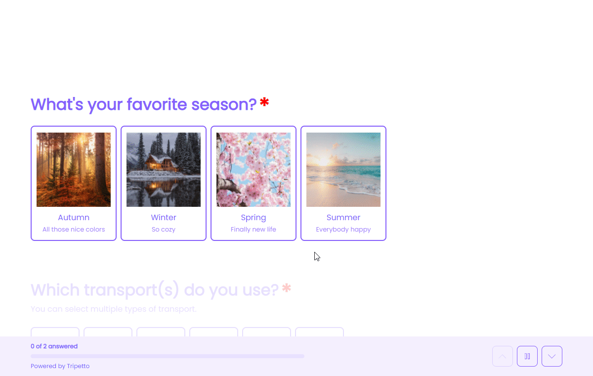
Use the picture choice block to let your respondents select one or multiple items from a set of picture choices you provide them. Each picture choice can contain an image or an emoji.
How to use
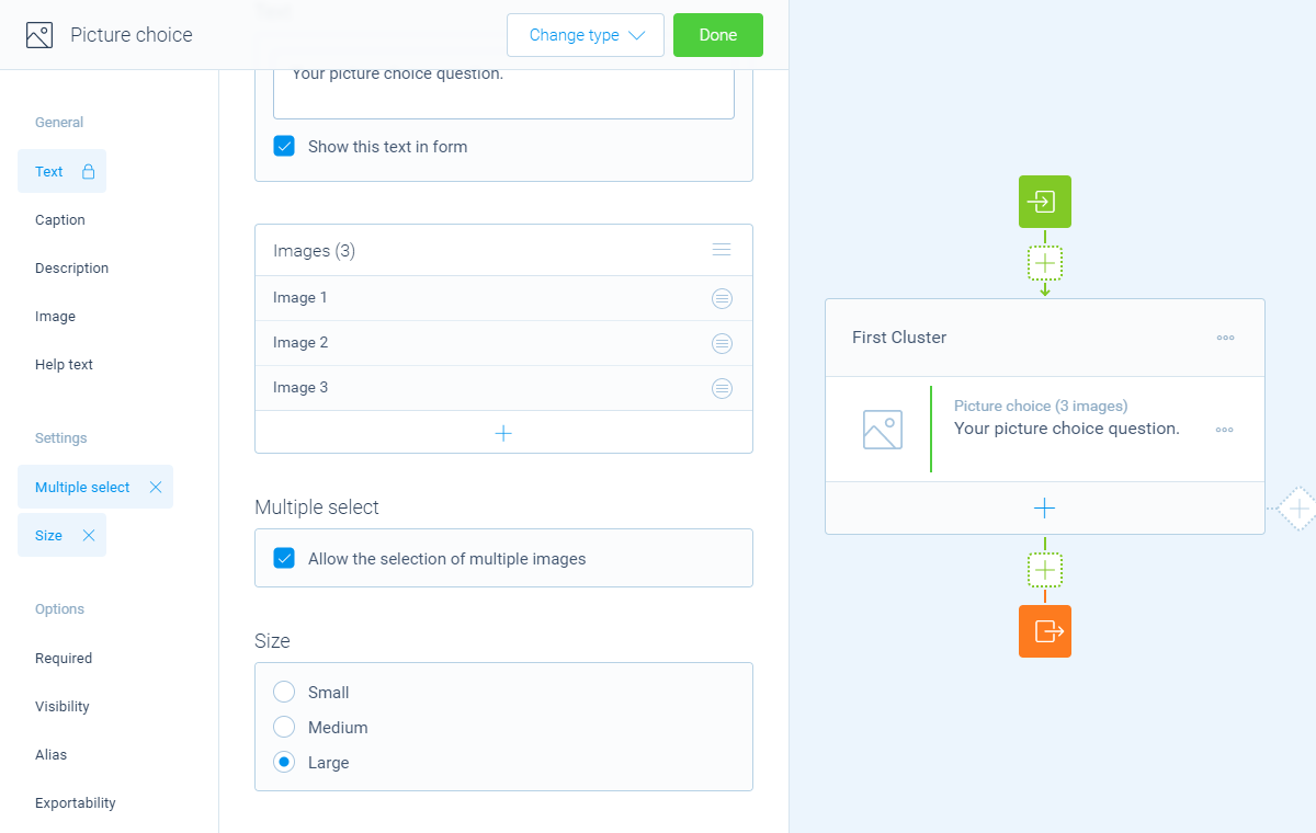
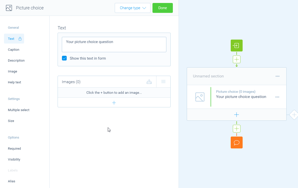
Add a new block to your form and then select the question type Picture choice. You can now customize this block to your needs with the following features:
- Text
Use theTextfeature for the name/title of this block. - Caption
Use theCaptionfeature to add an extra caption to this block. - Description
Enable theDescriptionfeature to add a description to this block. - Help text
Enable theHelp textfeature to add a help text to this block. - Image
Enable theImagefeature to add an image to this block.
Settings
- Multiple select
By default respondents can only select one choice from the list of choices. Enable theMultiple selectfeature to let respondents select multiple choice(s). - Limits
Enable theLimitsfeature to enter a minimum and maximum number of choices that respondents can select. This feature is only available if your question allows the selection of multiple answers. - Randomization
Enable theRandomizationfeature to present the choices in a random order to your respondents (using Fisher–Yates shuffle). - Size
By default the choices are shown as medium sized buttons. Enable theSizefeature to choose what size the buttons should have:Small,MediumorLarge.
Options
- Required
By default this block is not required to fill out by your respondents. Enable theRequiredfeature to make this block required to fill out. - Visibility
By default this block is visible in your form. Enable theVisibilityfeature to hide it for your respondents. - Labels
By default the choices will be marked asSelectedorNot selectedin your dataset (your results). Enable theLabelsfeature to overwrite these labels in your dataset with your own values. This feature is only available if your question allows the selection of multiple answers. - Score
You can attach scores to the choices to perform instant calculations. Enable theScorefeature to enter the desired score values. - Alias
By default the name/title of this block will be used in your dataset. Enable theAliasfeature to use a different name in your dataset. - Data format
By default the collected data of this block is stored as a separate value per available image. Enable theData formatfeature to determine how the data is stored in the dataset:- Every image as a separate field - Every image is included in the dataset as a separate value (
SelectedorNot selected). - Text field with a list of selected images - All the selected images are concatenated to a single string of text, separated using a configurable separator.
- Both - Includes every image in the dataset, together with the concatenated text.
- Every image as a separate field - Every image is included in the dataset as a separate value (
- Exportability
By default the collected data of this block will be stored to the dataset of each result. Enable theExportabilityfeature to take control over the storage. You can then include/exclude the data from your dataset. Please note that if you exclude data from the dataset you can never see and/or use the given answers from your respondents to this block, because the data is simply not stored at all.
Choices
Next, you can enter the list of choices that you want to show to your respondents:
- Add choices one by one
Click theicon at the bottom of the list and enter the choice name. - Import a list of choices
Click theicon at the top of the list. Now supply a list with one choice name per text line and clickImportto add them all at once to your list of choices.
From your list of choices you can open each choice to get to the settings of that single choice. Over there you can use these features:
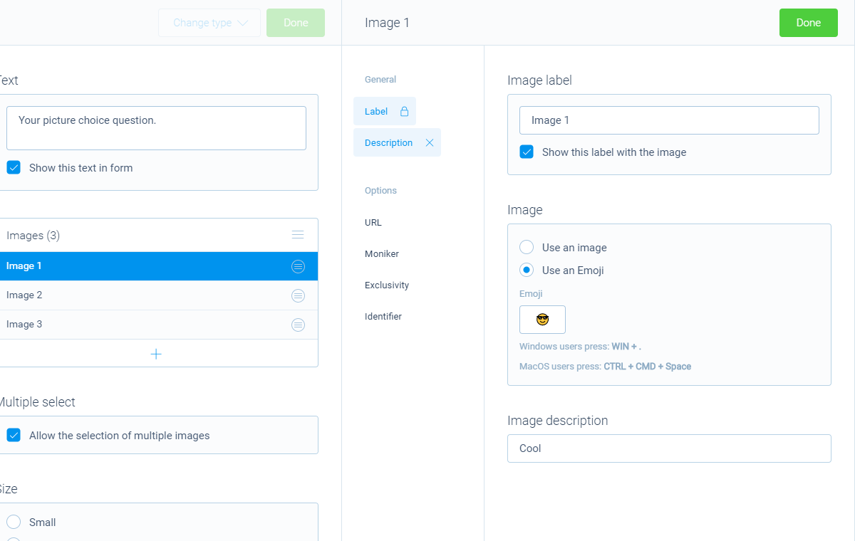
- Name
Use theNamefeature for the name/title of this choice. - Image
A picture choice always contains an image or emoji to show in the form.- Enable
Use an imageto enter a URL to the image you'd like to show. More information about using images can be found in this article; - Enable
Use an emojito enter an emoji icon you'd like to show. All emojis are available. You can easily search and select emojis using these keyboard shortcut:
Windows:Windows key+.
MacOS:CTRL+CMD+space
- Enable
- Description
Enable theDescriptionfeature to extend the choice name with a description, for example to show an extra explanation. This description is shown below the name. - URL
You can turn a choice into a real button that opens a URL. Enable theURLfeature to enter a URL that will be opened when a respondent clicks the option. You can also determine if that URL must be opened in the current browser tab/window or in a new browser tab/window.
Important notice: a choice that opens a URL can NOT be selected as an answer by your respondents. - Moniker
The moniker is a feature you can use when you're implementing a repeated follow-up for multiple selected options. Inside the block(s) of the repeated follow-up, you can use the label of the selected choice, so you can clarify which selected choice the follow-up question is about.
But sometimes the label you used in the button isn't usable in the context of your follow-up. A simple example of such a scenario is when you entered the label in the button with a capital first letter, but you want to mention the label in the middle of a sentence in the follow-up (without a capital letter). Enable theMonikerfeature to enter a deviant label to use in the follow-up. This feature is only available if your question allows the selection of multiple answers. - Color
Enable theColorfeature to configure an alternative color for this particular choice button. Simply select a color from the color control, or enter a color in RGB(A) format or HEX format. This color overrules the default button color from the Styles pane. - Exclusivity
Enable theExclusivityfeature to make that choice exclusive. If a respondent selects that choice, all other choices will be unselected, making the selected choice exclusive. This feature is only available if your question allows the selection of multiple answers. - Labels
By default each choice will be marked asSelectedorNot selectedin your dataset (your results). Enable theLabelsfeature to overwrite these labels in your dataset with your own values for each choice individually. This feature is only available if your question allows the selection of multiple answers. - Identifier
By default the name of each choice will be used in your dataset. Enable theIdentifierfeature to use a different name in your dataset. - Score
Enable theScorefeature to enter the desired score value for that choice.
Logic
Logic is important to make your forms smart and conversational. The picture choice block can work with the following branch conditions to help you with that:
Block conditions
- Match one of the options;
- No image selected.
Evaluate conditions
Conditions for whole block:
- Value matches
your filter; - Value does not match
your filter; - Value contains
your filter; - Value does not contain
your filter; - Value starts with
your filter; - Value ends with
your filter; - Value is empty;
- Value is not empty.
Conditions for each option:
- Option is true;
- Option is false;
- Option equals
your filter; - Option not equals
your filter; - Option is empty;
- Option is not empty.
Counter conditions
Conditions based on the number of selected options (only available for multiple select):
- Counter is equal to
your filter; - Counter is not equal to
your filter; - Counter is lower than
your filter; - Counter is higher than
your filter; - Counter is between
your filters; - Counter is not between
your filters.
Score conditions
Conditions based on the total score of the selected options (only available for multiple select):
- Score is equal to
your filter; - Score is not equal to
your filter; - Score is lower than
your filter; - Score is higher than
your filter; - Score is between
your filters; - Score is not between
your filters; - Score is calculated;
- Score is not calculated.
Filters
When we mention your filter above, there are some different filters that you can use to make the right comparison:
- Text - Compare with a fixed text that you enter;
- Value - Compare with another block value entered in the form by a respondent (more info).
Calculations
You can use the calculator block to perform calculations with given answers. The multiple choice block supports the following calculation operations:
- Score - Calculate a score based on the entered score list for choices;
- Count - Count the number of selected choices. Only available for multiple select;
- Choice value - Output a value based on an individual selected/not-selected choice (boolean). Only available for multiple select.