How to style your forms
You can style all your forms completely to your needs, for example to meet your company's brand. You can start simple with just one base color, or modify each element's appearance in your form.

About styling
Before we start styling, let's explain a few things that could be handy while styling your forms.
Color selecting
There are a few ways to enter your desired colors in Tripetto:
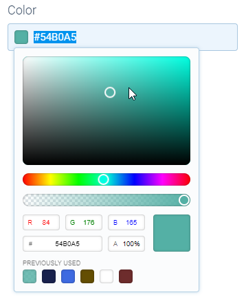
- Select via the color control - This is the easiest way to select a color in Tripetto. Just click the color field to open the color control and select your desired color from the color pane, RGB(A) input or HEX input. The color control also keeps a swatch panel of previously used colors, so you can easily select corresponding colors that are already used in your template;
- Enter a color name - Just type the name of one of the 140 predefined colors that work in all modern browsers (see full list of available color names);
- Enter a HEX color code - Need a custom color that's not on the color names list? Just enter any HEX color code, prefixed with a
#; - Enter a RGB(A) color code - Rather use the RGB(A) notation instead of HEX? No problem, just enter your RGB(A) color in the right format:
rgb()orrgba()(with transparency level); - Transparent - You can also enter
transparentas a color, for example to make the background color of your form transparent.
Color contrast
Always make sure your form stays well readable while applying colors to it. The form will automatically try to keep the right amount of contrast, but you can always overrule that with your own color settings.
How to style forms
At the top menu bar of the form builder click CustomizeStyles.
💡 Tip: Use live form preview
The live preview in the form builder is your biggest friend while styling. It always updates to what you're doing, so also everything you do to style your forms, will immediately be visible in the live preview. More information:
Base color
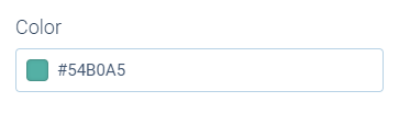
You can start with selecting just one simple base color. That color already will have a major effect on the styling of your form, as you can see in the live preview.
It depends on the selected form face what the effect of this base color is.
Font
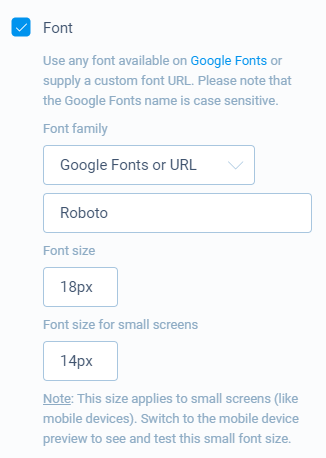
Next step that has a major impact on your styling is the font. To enable font styling, activate the Font option in the Styles pane. You can now set the font family and font size.
You can simply select one of the predefined fonts that work in all browsers, but if you really want to show off you also can use any Google Font or even your own font.
For more detailed instructions about fonts, please have a look at this article:
Background
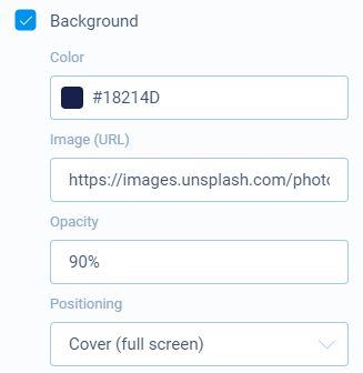
To style the background with a color and/or a background image, activate the Background option in the Styles pane.
You can now supply a background color as a color name, HEX code or RGB code.
Background image
You can also add an image as the background of your form. You can enter the URL to an image and then determine how the image must be positioned over the screen size.
Inputs
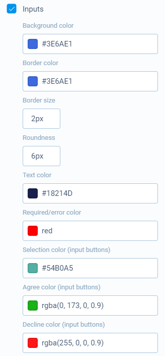
Input fields of course are an important part of your conversational forms. To enable input styling, activate the Inputs option in the Styles pane.
Input fields
Input fields are common form elements, like text fields, checkboxes and radio buttons. Those are all stylable by multiple colors, border size and roundness. Just play with them and see the result in the live preview.
Input buttons
Some question types, like Multiple choice, Rating and yes/no are presented with input buttons. You can style the following states of those buttons:
- Selection color - The color of buttons used in Multiple choice and Rating blocks;
- Agree color - The color of
Yesbuttons used in yes/no blocks; - Decline color - The color of
Nobuttons used in yes/no blocks;
Buttons
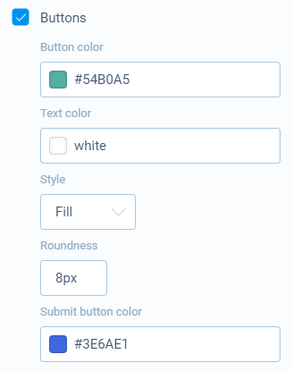
Buttons are used in several places, like start buttons, navigation buttons and complete buttons. To enable button styling, activate the Buttons option in the Styles pane.
Buttons are stylable by color and style. With the button style you can determine if the buttons should be filled with the desired color, or shown as a button with only border coloring. The roundness sets the border radius of your buttons.
Submit button
The Submit button at the end of your form is of course an important button, so you can set a custom color for that button.
Style form faces
The above describes how you can style your forms in general. On top of that Tripetto offers three different form faces, completely changing the form layout.
In regards to customization, each form face comes with its own additional settings and styling options to improve the finishing touch. Click the help articles below to see these options for each form face: