Creating a visual block
A visual block for Tripetto is often a new question type you wish to add. It needs two parts to work properly:
- A builder part that makes the block available to the visual builder, so the block becomes usable in a form;
- A runner part that handles the rendering of the block in the runner that runs the form (the visual part of the block).
This tutorial covers both parts, beginning with the builder part. Let's assume we want to build a new question type to collect text input (single or multi-line) from the form respondent. In this example we are going to use the default HTML input and textarea controls in the runner part.
🏗️ Builder part
The builder part of a block allows the visual builder to consume the block. It allows the builder user (form editor) to select the new block, attach it to a node, and configure all of its properties and settings. For this tutorial, we'll start from scratch and prepare a new project for our text input block (you may skip this and jump straight to the block implementation when you don't need help preparing your project).
Can't wait to see the result of the builder part tutorial? Click the buttons below to run or try a live code example.
▶️ Prepare your project
1️⃣ Create a project
First, create a new folder for the project (for example, text-input-block). Then open a command-line terminal for that new folder and run the following command to initiate the project:
- npm
- Yarn
- pnpm
npm init
yarn init
pnpm init
You can just hit the enter key for all questions asked when running the init command. The default configuration is good for now.
2️⃣ Add dependencies
Now we can add the required packages for our block. In this example, we'll use webpack as bundler. Besides the webpack dependencies we need the TypeScript compiler and Tripetto's Builder package. We also add image-webpack-loader and url-loader to enable webpack to process images, ts-loader to process TypeScript with webpack and concurrently to allow to run Tripetto's builder and webpack simultaneous during development. Let's add these dependencies by running the following command in your project folder:
- npm
- Yarn
- pnpm
npm install @tripetto/builder typescript webpack webpack-cli image-webpack-loader url-loader ts-loader concurrently
yarn add @tripetto/builder typescript webpack webpack-cli image-webpack-loader url-loader ts-loader concurrently
pnpm add @tripetto/builder typescript webpack webpack-cli image-webpack-loader url-loader ts-loader concurrently
3️⃣ Add configuration files
Next, add the following files to the root of your project folder. It's the configuration for the TypeScript compiler and webpack bundler.
- tsconfig.json
- webpack.config.js
{
  "compileOnSave": false,
  "compilerOptions": {
    "target": "ES5",
    "moduleResolution": "Node",
    "newLine": "LF",
    "strict": true,
    "experimentalDecorators": true
  },
  "include": ["./src/**/*.ts"]
}
Make sure the experimentalDecorators feature is enabled. We need support for decorators.
const path = require("path");

module.exports = {
  target: ["web", "es5"],
  entry: "./src/index.ts",
  output: {
    path: path.resolve(__dirname, "dist"),
    filename: "builder.bundle.js",
  },
  module: {
    rules: [
      {
        test: /\.ts$/,
        loader: "ts-loader",
      },
      {
        test: /\.svg$/,
        use: ["url-loader", "image-webpack-loader"],
      },
    ],
  },
  resolve: {
    extensions: [".ts", ".js"],
  },
  externals: {
    // Make sure to exclude the builder from the bundle!
    "@tripetto/builder": "Tripetto",
  },
};
4️⃣ Project configuration
Now open the package.json file that was generated in the first step and add the highlighted lines to it:
{
  "name": "text-input-block",
  "main": "./dist/builder.bundle.js",
  "scripts": {
    "test": "webpack --mode development && concurrently -n \"tripetto,webpack\" -c \"blue.bold,green\" -k -s \"first\" \"tripetto ./example.json --verbose\" \"webpack --mode development --watch\""
  },
  "dependencies": {
    "@tripetto/builder": "^5.0.30",
    "image-webpack-loader": "^8.1.0",
    "ts-loader": "^9.2.8",
    "typescript": "^4.6.3",
    "webpack": "^5.72.0",
    "webpack-cli": "^4.9.2"
  },
  "tripetto": {
    "blocks": [
      "."
    ]
  }
}
Here the main property specifies the location of the JS bundle that webpack will generate. The tripetto section contains the configuration for the builder. In this case, it tries to load the block that's in the same folder (.). Tripetto will lookup the package.json file and read the main property to find the right JS file for the block.
More information about configuring the Tripetto CLI using package.json can be found in the configuration section of the builder documentation.
5️⃣ Prepare source file
The last step before we will test the setup is to add an empty source file that we'll use later on to declare the block in. Create a folder with the name src and add an empty file to it with the name index.ts. This will be the entry point for the block. The structure of the project should now look something like this:
project/
├─ src/
│  └─ index.ts
├─ package.json
├─ tsconfig.json
└─ webpack.config.js
6️⃣ Test it!
Now you should be able to run this setup. Run the following command to start webpack together with the Tripetto builder:
- npm
- Yarn
- pnpm
npm test
yarn test
pnpm test
Webpack will now monitor code changes and update the bundle on each change. Hit F5 in the browser to reload the builder with the updated bundle. Or follow the bonus step below to enable live-reloading of the builder.
7️⃣ Live-reloading (bonus)
If you want, you can enable live-reloading of the builder on each code change. To enable that, we need the webpack-livereload-plugin package:
- npm
- Yarn
- pnpm
npm install webpack-livereload-plugin
yarn add webpack-livereload-plugin
pnpm add webpack-livereload-plugin
Then, open webpack.config.js and add the highlighted lines:
const path = require("path");
const webpackLiveReload = require("webpack-livereload-plugin");

module.exports = {
  target: ["web", "es5"],
  entry: "./src/index.ts",
  output: {
    path: path.resolve(__dirname, "dist"),
    filename: "builder.bundle.js",
  },
  module: {
    rules: [
      {
        test: /\.ts$/,
        loader: "ts-loader",
      },
      {
        test: /\.svg$/,
        use: ["url-loader", "image-webpack-loader"],
      },
    ],
  },
  resolve: {
    extensions: [".ts", ".js"],
  },
  externals: {
    // Make sure to exclude the builder from the bundle!
    "@tripetto/builder": "Tripetto",
  },
  plugins: [
    new webpackLiveReload({
      appendScriptTag: true,
    }),
  ]
};
Now the builder should automatically reload the bundle when the code is changed.
▶️ Block implementation
Now we get to the interesting part: Building the actual block!
1️⃣ Declare the block
Let's start with the basic code of a visual block and then go through that code. Update your empty index.ts file to the code shown below and add the file icon.svg to the same folder (it's the icon that Tripetto will use for this block).
- index.ts
- icon.svg
import { tripetto, NodeBlock } from "@tripetto/builder";
import icon from "./icon.svg";

@tripetto({
  type: "node",
  identifier: "text-input",
  label: "Text input",
  icon
})
class TextInputBlock extends NodeBlock {
  // Block implementation here
}
<?xml version="1.0" encoding="utf-8"?>
<!DOCTYPE svg PUBLIC "-//W3C//DTD SVG 1.1//EN" "http://www.w3.org/Graphics/SVG/1.1/DTD/svg11.dtd">
<svg version="1.1" xmlns="http://www.w3.org/2000/svg" xmlns:xlink="http://www.w3.org/1999/xlink" width="20" height="20" viewBox="0 0 20 20">
<path d="M16.534 15.745l-4.534-8.371v-4.773c0.603-0.246 1-0.609 1-1.101 0-1.036-1.758-1.5-3.5-1.5s-3.5 0.464-3.5 1.5c0 0.492 0.397 0.855 1 1.101v4.773l-4.534 8.371c-0.594 1.097-0.651 2.154-0.16 2.978s1.448 1.277 2.695 1.277h9c1.247 0 2.204-0.454 2.695-1.277s0.434-1.881-0.16-2.978zM9.5 1c1.382 0 2.22 0.315 2.455 0.5-0.235 0.185-1.073 0.5-2.455 0.5s-2.22-0.315-2.455-0.5c0.235-0.185 1.073-0.5 2.455-0.5zM9.5 3c0.514 0 1.029-0.040 1.5-0.124v4.622c-0 0.018 0.001 0.035 0.003 0.053 0 0.003 0.001 0.005 0.001 0.008 0.002 0.013 0.003 0.027 0.006 0.040 0.002 0.008 0.004 0.016 0.006 0.024s0.004 0.015 0.006 0.023 0.009 0.027 0.015 0.041c0.001 0.002 0.001 0.004 0.002 0.006 0.007 0.016 0.015 0.032 0.023 0.048l3.39 6.259c-0.726-0.013-1.222-0.321-1.873-0.879-0.418-0.358-0.962-0.804-1.58-1.186-0.035-1.073-0.917-1.935-1.998-1.935-0.758 0-1.419 0.424-1.758 1.048-0.43 0.054-0.851 0.155-1.257 0.3l1.954-3.608c0.008-0.015 0.016-0.031 0.023-0.047 0.001-0.003 0.002-0.005 0.003-0.008 0.005-0.013 0.010-0.025 0.014-0.038 0.002-0.008 0.004-0.016 0.006-0.024s0.004-0.015 0.006-0.023 0.005-0.028 0.006-0.042c0-0.002 0.001-0.004 0.001-0.007 0.002-0.018 0.003-0.035 0.003-0.053v-4.622c0.471 0.083 0.986 0.124 1.5 0.124zM9 11c0.551 0 1 0.449 1 1s-0.449 1-1 1-1-0.449-1-1 0.449-1 1-1zM15.836 18.211c-0.303 0.509-0.955 0.789-1.836 0.789h-9c-0.881 0-1.533-0.28-1.836-0.789s-0.239-1.216 0.181-1.99l1.802-3.327c0.56-0.39 1.191-0.659 1.856-0.794 0.052 1.056 0.928 1.9 1.997 1.9 0.753 0 1.41-0.418 1.751-1.034 0.449 0.303 0.853 0.636 1.177 0.914 0.807 0.692 1.519 1.12 2.572 1.12 0.16 0 0.319-0.011 0.476-0.033l0.679 1.254c0.419 0.774 0.484 1.481 0.181 1.99z" class="tripetto-fill"></path>
<path d="M6.5 15c-0.827 0-1.5 0.673-1.5 1.5s0.673 1.5 1.5 1.5 1.5-0.673 1.5-1.5-0.673-1.5-1.5-1.5zM6.5 17c-0.276 0-0.5-0.224-0.5-0.5s0.224-0.5 0.5-0.5 0.5 0.224 0.5 0.5-0.224 0.5-0.5 0.5z" class="tripetto-fill"></path>
<path d="M9.5 15c-0.132 0-0.26 0.053-0.353 0.147s-0.147 0.222-0.147 0.353 0.053 0.261 0.147 0.353c0.093 0.093 0.222 0.147 0.353 0.147s0.261-0.053 0.353-0.147c0.093-0.093 0.147-0.222 0.147-0.353s-0.053-0.261-0.147-0.353c-0.093-0.093-0.222-0.147-0.353-0.147z" class="tripetto-fill"></path>
</svg>
This code is all you need to declare a new class with the name TextInputBlock. The class is derived from the base class NodeBlock that is imported from the Tripetto builder package. The base class has all the core functionality of a block, so you can easily extend it with the functionality you need. This example has no further implementation yet, so the class is still empty. We'll come to that in a moment.
First, let's talk about the @tripetto decorator. This so-called class decorator is used to register the block to the Tripetto builder. Tripetto uses dependency injection to retrieve blocks that are registered using the decorator. The identifier, label, and icon of the block are all supplied to that decorator and are used by the visual builder to allow the user to select the block and assign it to a node.
Now we can add the functionality to the block that we need for the text input question type. We need to do three things for that on the builder part:
- Define the data the block will collect;
- Add a property that holds if the input type is single or multi-line;
- Instruct the builder how the user can manage the block properties and settings.
Let's do that in the following steps!
2️⃣ Define block slots
The next step is to specify the type of data this block will collect. In the Tripetto world, data is collected using slots. Each slot can contain a single data item. In this case, we need a single slot that can hold the text input value, which is a string. So, we are going to use the String slot type for that. To define the slot, we need to add a method to our block class and decorate it with the @slots decorator. This decorator instructs Tripetto to use that method when it needs the slots for the block. Update the highlighted lines in index.ts:
import { tripetto, slots, NodeBlock, Slots } from "@tripetto/builder";
import icon from "./icon.svg";

@tripetto({
  type: "node",
  identifier: "text-input",
  label: "Text input",
  icon
})
class TextInputBlock extends NodeBlock {
  @slots
  onSlots(): void {
    this.slots.static({
      type: Slots.String,
      reference: "value",
      label: "Text input value"
    });
  }
}
As you can see, we've added a new method onSlots (you can choose any name you want for this method), and decorated it with @slots. The method implements the slots field of the TextInputBlock class to create a new static slot for the text input value. And that's all you need to do on the builder part. You will see later on in this tutorial how we will use this slot to supply a value to it in the runner part of the block.
Read the Slots guide to learn more about slots and its possibilities.
3️⃣ Define block properties
Next, we want to add a property to the TextInputBlock class to allow the user to specify if the block will collect single or multi-line text. This is as simple as adding a field to the class and decorate it with the @definition decorator. This decorator instructs the builder to include the field in the form definition. The property will then be automatically saved to and retrieved from the form definition. Update the highlighted lines in index.ts:
import { tripetto, slots, definition, NodeBlock, Slots } from "@tripetto/builder";
import icon from "./icon.svg";

@tripetto({
  type: "node",
  identifier: "text-input",
  label: "Text input",
  icon
})
class TextInputBlock extends NodeBlock {
  @definition
  isMultiline?: boolean;

  @slots
  onSlots(): void {
    this.slots.static({
      type: Slots.String,
      reference: "value",
      label: "Text input value"
    });
  }
}
Read the Properties guide to learn more about defining properties for your block.
4️⃣ Define block editor
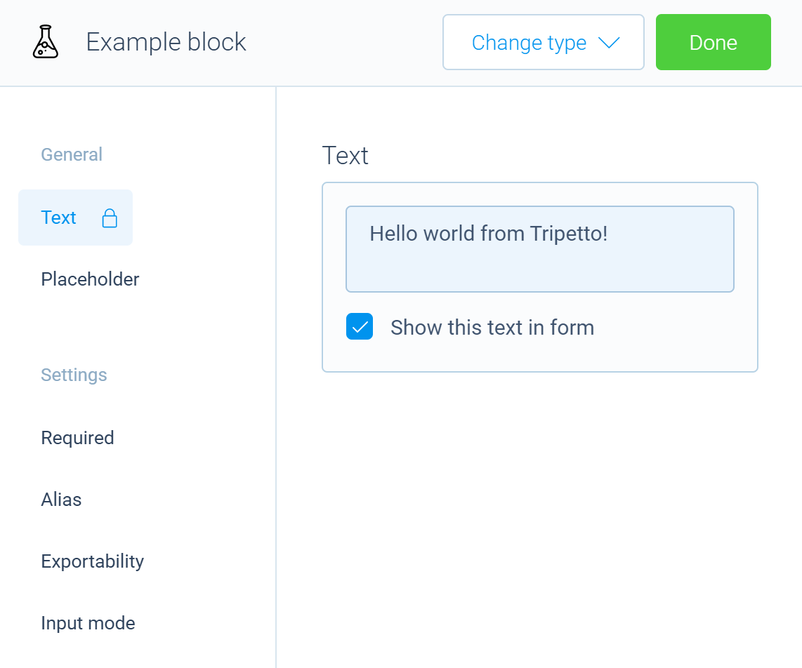
The final step is to instruct the builder how to manage the properties and settings for the block. These properties and settings can be managed by clicking on a node that has the block assigned. It will open an editor panel that shows all the properties and settings for the block. For our text input block, we are going to define six elements that can be managed:
- The name of the block;
- A placeholder to show in the text input field when it is empty;
- A toggle to specify if a value is required or not;
- A toggle to specify an alias for the slot in the form dataset;
- A toggle to specify if the slot should be included in the form dataset or not;
- A feature to specify if the input mode is single or multi-line.
The result will look something like this:
Again we need to add a method to the TextInputBlock class and then decorate it with the @editor decorator. This method will be invoked by the builder when the editor panel for the block is requested. We can use the editor field of the TextInputBlock class to define UI controls to manage the block. Update the highlighted lines in index.ts:
import { tripetto, slots, definition, editor, isBoolean, NodeBlock, Slots, Forms } from "@tripetto/builder";
import icon from "./icon.svg";

@tripetto({
  type: "node",
  identifier: "text-input",
  label: "Text input",
  icon
})
class TextInputBlock extends NodeBlock {
  @definition
  isMultiline?: boolean;

  // Add a field that holds a reference to the slot
  valueSlot!: Slots.String;

  @slots
  onSlots(): void {
    this.valueSlot = this.slots.static({
      type: Slots.String,
      reference: "value",
      label: "Text input value"
    });
  }

  @editor
  onEdit(): void {
    // First add the general group title (see https://tripetto.com/sdk/docs/blocks/api/classes/EditorOrchestrator#groups)
    this.editor.groups.general();
    // Add the name feature (see https://tripetto.com/sdk/docs/blocks/api/classes/EditorOrchestrator#name)
    this.editor.name();
    // Add the placeholder feature (see https://tripetto.com/sdk/docs/blocks/api/classes/EditorOrchestrator#placeholder)
    this.editor.placeholder();

    // Add the settings group title (see https://tripetto.com/sdk/docs/blocks/api/classes/EditorOrchestrator#groups)
    this.editor.groups.settings();
    // Add the required feature (see https://tripetto.com/sdk/docs/blocks/api/classes/EditorOrchestrator#required)
    this.editor.required(this.valueSlot);
    // Add the alias feature (see https://tripetto.com/sdk/docs/blocks/api/classes/EditorOrchestrator#alias)
    this.editor.alias(this.valueSlot);
    // Add the exportable feature (see https://tripetto.com/sdk/docs/blocks/api/classes/EditorOrchestrator#exportable)
    this.editor.exportable(this.valueSlot);

    // Add a custom feature to toggle the text input mode (see https://tripetto.com/sdk/docs/blocks/api/classes/EditorOrchestrator#option)
    this.editor.option({
      name: "Input mode",
      form: {
        title: "Text input mode",
        controls: [
          new Forms.Checkbox(
            "Allow multi-line text input",
            Forms.Checkbox.bind(this, "isMultiline", false, true)
          )
        ],
      },
      activated: isBoolean(this.isMultiline)
    });
  }
}
This code utilizes the built-in controls for editing the name, and placeholder of a block, and the required, alias, and exportable properties of the slot. We also use the option method to define a custom feature that controls if the text input supports single- or multi-line text input.
Read the Block editor guide to learn more about building block editor panels.
💯 Builder part done!
And there, we have completed the builder part of the block! You can now create an example form definition that contains your new block. Click the Save button in the toolbar of the builder CLI to save it to ./example.json. The contents of this file can be supplied to the runner while developing/testing the runner part.
Next, we're going to define the runner part of the block.
🏃 Runner part
The runner part of a visual block handles the rendering of the block in the runner. It also collects the data for the block and performs any validation if necessary. The rendering of the block greatly depends on the type of runner that is targeted. In this tutorial we will use the Autoscroll runner, but the implementation for the other stock runners is similar. If you have a custom runner, the implementation depends on the structure of that runner, and the implementation may deviate from what is shown here.
Just like for the builder part, we'll start from scratch and prepare a new project for implementing the text input block in the runner (you may skip this and jump straight to the block implementation when you don't need help preparing your project). Let's get started!
Can't wait to see the end result of the runner part tutorial? Click the buttons below to run or try a live code example.
▶️ Prepare your project
1️⃣ Create a project
First, create a new folder for the project. Then open a command-line shell for that new folder and run the following command to initiate the project:
- npm
- Yarn
- pnpm
npm init
yarn init
pnpm init
You can just hit the enter key for all questions asked when running the init command. The default configuration is good for now.
2️⃣ Add dependencies
Now we can add the required packages for our block. In this example, we'll use webpack as bundler, but you can use any other bundler if you like. Besides the webpack dependencies we need the TypeScript compiler and, of course, the Tripetto Runner library and Tripetto Autoscroll Runner packages. The stock runners use React, and you need to install that as well. In this example we use webpack-dev-server to run it. Let's add all these dependencies by running the following command in your project folder:
- npm
- Yarn
- pnpm
npm install @tripetto/runner @tripetto/runner-autoscroll react react-dom typescript webpack webpack-cli ts-loader webpack-dev-server
yarn add @tripetto/runner @tripetto/runner-autoscroll react react-dom typescript webpack webpack-cli ts-loader webpack-dev-server
pnpm add @tripetto/runner @tripetto/runner-autoscroll react react-dom typescript webpack webpack-cli ts-loader webpack-dev-server
3️⃣ Add configuration files
Next, add the following files to the root of your project folder. It's the configuration for the TypeScript compiler and webpack bundler.
- tsconfig.json
- webpack.config.js
{
  "compileOnSave": false,
  "compilerOptions": {
    "jsx": "react",
    "target": "ES5",
    "moduleResolution": "Node",
    "newLine": "LF",
    "strict": true,
    "experimentalDecorators": true
  },
  "include": ["./src/**/*.tsx"]
}
Make sure the experimentalDecorators feature is enabled. We need support for decorators.
const path = require("path");

module.exports = {
  target: "web",
  entry: "./src/index.tsx",
  output: {
    path: path.resolve(__dirname, "dist"),
    filename: "runner.bundle.js",
  },
  module: {
    rules: [
      {
        test: /\.tsx?$/,
        loader: "ts-loader",
      },
    ],
  },
  resolve: {
    extensions: [".ts", ".js"],
  },
  devServer: {
    static: path.resolve(__dirname, "static"),
    port: 9000,
    host: "0.0.0.0",
  },
};
4️⃣ Project configuration
Now open the package.json file that was generated in the first step and add the highlighted line to it:
{
  "name": "text-input-block",
  "scripts": {
    "test": "webpack-dev-server --mode development"
  },
  "dependencies": {
    "@tripetto/runner-autoscroll": "^7.0.2",
    "@tripetto/runner": "^7.0.11",
    "react": "^18.0.0",
    "react-dom": "^18.0.0",
    "ts-loader": "^9.2.8",
    "typescript": "^4.6.3",
    "webpack": "^5.72.0",
    "webpack-cli": "^4.9.2",
    "webpack-dev-server": "^4.8.1"
  }
}
5️⃣ Add files
The last step before we will test the setup is to add some files. Create two folders with the name src and static. Then add the file index.tsx to the src folder and index.html to the static folder.
Make sure to replace the code /* Supply your form definition here */ in index.tsx with a form definition that contains your new block.
- src/index.tsx
- static/index.html
import { run } from "@tripetto/runner-autoscroll";

run({
  display: "page",
  definition: /* Supply your form definition here */
});
<!DOCTYPE html>
<html lang="en">
  <head>
    <meta charset="UTF-8" />
    <meta
      name="viewport"
      content="width=device-width, initial-scale=1.0, maximum-scale=1.0, user-scalable=0"
    />
  </head>
  <body>
    <script src="runner.bundle.js"></script>
  </body>
</html>
The structure of the project should now look something like this:
project/
├─ src/
│  └─ index.tsx
├─ static/
│  └─ index.html
├─ package.json
├─ tsconfig.json
└─ webpack.config.js
6️⃣ Test it!
Now you should be able to run this setup. Run the command below to start the development server. Then browse to http://localhost:9000/ to see the runner in action!
- npm
- Yarn
- pnpm
npm test
yarn test
pnpm test
▶️ Block implementation
Now that we have the runner up and running, it's time to implement the runner part of the block.
1️⃣ Declare the block
Let's start with the basic code of the runner part of a visual block and then go through that code. Update the index.tsx file to the code shown below:
import { tripetto, NodeBlock } from "@tripetto/runner";
import { run, namespace, IAutoscrollRendering } from "@tripetto/runner-autoscroll";

@tripetto({
  type: "node",
  namespace,
  identifier: "text-input",
})
class TextInputBlock extends NodeBlock implements IAutoscrollRendering {
  // Block implementation here
}

run({
  display: "page",
  definition: /* Supply your form definition here */
});
This code declares a new class with the name TextInputBlock. The class is derived from the base class NodeBlock that is imported from the Tripetto Runner library. It also implements the interface IAutoscrollRendering from the Tripetto Autoscroll runner. That interface dictates what the class must implement in order to work with the runner.
The @tripetto decorator is used to register the block to the Tripetto runner. In this case, the namespace of the Autoscroll runner is supplied. This assures the block is registered under the namespace of that runner.
Now we can add functionality to the block. We need to do three things on the runner part:
- Define the block properties that are declared in the builder part;
- Implement block validation;
- Implement block rendering.
Let's do that in the following steps!
2️⃣ Define block properties
In our builder part we declared a field isMultiline that is used to indicate if the text input control should be single or multi-line. We need this field in the runner part, so we add the property to the runner part class declaration to make it available to the class. Update the highlighted lines in the TextInputBlock class:
import { tripetto, NodeBlock } from "@tripetto/runner";
import { run, namespace, IAutoscrollRendering } from "@tripetto/runner-autoscroll";

@tripetto({
  type: "node",
  namespace,
  identifier: "text-input",
})
class TextInputBlock extends NodeBlock<{
  isMultiline?: boolean;
}> implements IAutoscrollRendering {
  // Block implementation here
}

run({
  display: "page",
  definition: /* Supply your form definition here */
});
This will make isMultiline available in the props field of the TextInputBlock class.
Read the Properties guide to learn more about defining properties for your block.
3️⃣ Define block validation
The next step is to implement block validation. In this case, that's very simple: It's already done for you! That's because our text input block only has an optional required flag that specifies if a value is required or not. Since this is controlled using the required field of the String slot, the validation is automatically applied in the background. So we don't have to implement anything for this question type. Required slots need a value before the block validation can pass.
Read the Validation guide to learn how to implement custom validation and when you need it.
4️⃣ Define block rendering
The final step for the runner part of the block is actual rendering it. The stock runners use React for this and the IAutoscrollRendering defines a render method we need to implement. Update the highlighted lines in index.tsx:
import { tripetto, NodeBlock } from "@tripetto/runner";
import { run, namespace, IAutoscrollRendering, IAutoscrollRenderProps } from "@tripetto/runner-autoscroll";
import * as React from "react";

@tripetto({
  type: "node",
  namespace,
  identifier: "text-input",
})
class TextInputBlock extends NodeBlock<{
  isMultiline?: boolean;
}> implements IAutoscrollRendering {
   render(props: IAutoscrollRenderProps, done?: () => void): React.ReactNode {
    const value = this.valueOf("value");

    return (
      <>
        {props.name}
        {this.props.isMultiline ? (
          <textarea
            onChange={(e) => value?.set(e.target.value)}
            placeholder={props.placeholder}
          >
            {value?.string}
          </textarea>
        ) : (
          <input
            type="text"
            value={value?.string}
            onChange={(e) => value?.set(e.target.value)}
            placeholder={props.placeholder}
            onKeyDown={done && ((e) => {
              // When the enter key is pressed, indicate we're done!
              if (e.key === "Enter") {
                done();
              }
            })}
          />
        )}
      </>
    );
  }
}

run({
  display: "page",
  definition: /* Supply your form definition here */
});
The render method is very simple. It should return the HTML code for the block using React. The slot value (that was defined in the builder part of the block) is retrieved using the valueOf method of the TextInputBlock class. Based on the value of the isMultiline property, a textarea or input control is rendered. When the value of the field changes, it updates the slot value of the block. This then automatically triggers a validation cycle.
💯 Runner part done!
That's all we need to do for the runner part of our example text input block.
Read the Stock runners custom blocks guide for more information about developing custom blocks for the stock runners.
⏭️ Up next
Now you can extend this block with a condition block to verify the value of the text input.
Dive deeper into the following topics to master the art of building blocks for Tripetto:
- 🎭 Block icon
- 🏷️ Block properties
- 🎛️ Block editor
- 🗃️ Slots
- 📇 Collections
- ✅ Validation
- ⤵️ Conditions
- 🎬 Post-processing actions
- 🌍 Translations
- 📂 Boilerplate