Collections
Collections are used to define lists of items within blocks. For example, options in a dropdown block. This guide shows how to create a collection.
🔖 Declaring an item
The first step is to define the item type for the collection. This is done using the Collection.Item base class. Let's start with a simple example where we define an option for a dropdown list:
import { tripetto, definition, name, Collection, NodeBlock } from "@tripetto/builder";

class DropdownOption extends Collection.Item<Dropdown> {
  @definition
  @name
  name = "";

  @definition
  alias?: string;
}

@tripetto({
  type: "node",
  identifier: "dropdown",
  label: "Dropdown",
  icon: "data:image/svg+xml;base64,PHN2ZyAvPg=="
})
class Dropdown extends NodeBlock {}
Here we define a new class DropdownOption that is derived from Collection.Item. This base class needs to know the class type that holds the collection. So in the example, we also defined an empty block Dropdown that we will use to add the collection to. The DropdownOption class has two fields for the name and alias of the dropdown option. Those fields are decorated with the @definition decorator, so they become part of the form definition. The name field is also decorated with the @name decorator. This specifies the field that contains the name of the item that is shown in the list in the builder.
There are more decorators you can use for collection items.
📇 Declaring the collection
The next step is declaring the actual collection in the dropdown block. To do that, we use a special helper function Collection.of. It does two things:
- Creates a collection provider for managing the collection;
- Decorates the collection field with the
@definitiondecorator so it becomes part of the form definition (so you don't have to apply the@definitiondecorator to a collection field).
Let's extend the example and declare the collection:
import { tripetto, definition, name, Collection, NodeBlock } from "@tripetto/builder";

class DropdownOption extends Collection.Item<Dropdown> {
  @definition
  @name
  name = "";

  @definition
  alias?: string;
}

@tripetto({
  type: "node",
  identifier: "dropdown",
  label: "Dropdown",
  icon: "data:image/svg+xml;base64,PHN2ZyAvPg=="
})
class Dropdown extends NodeBlock {
  options = Collection.of<DropdownOption, Dropdown>(DropdownOption, this);
}
This creates a new field options that is a collection of DropdownOption instances. The collection is now automatically part of the form definition. All the items in the collection are stored in and retrieved from the form definition.
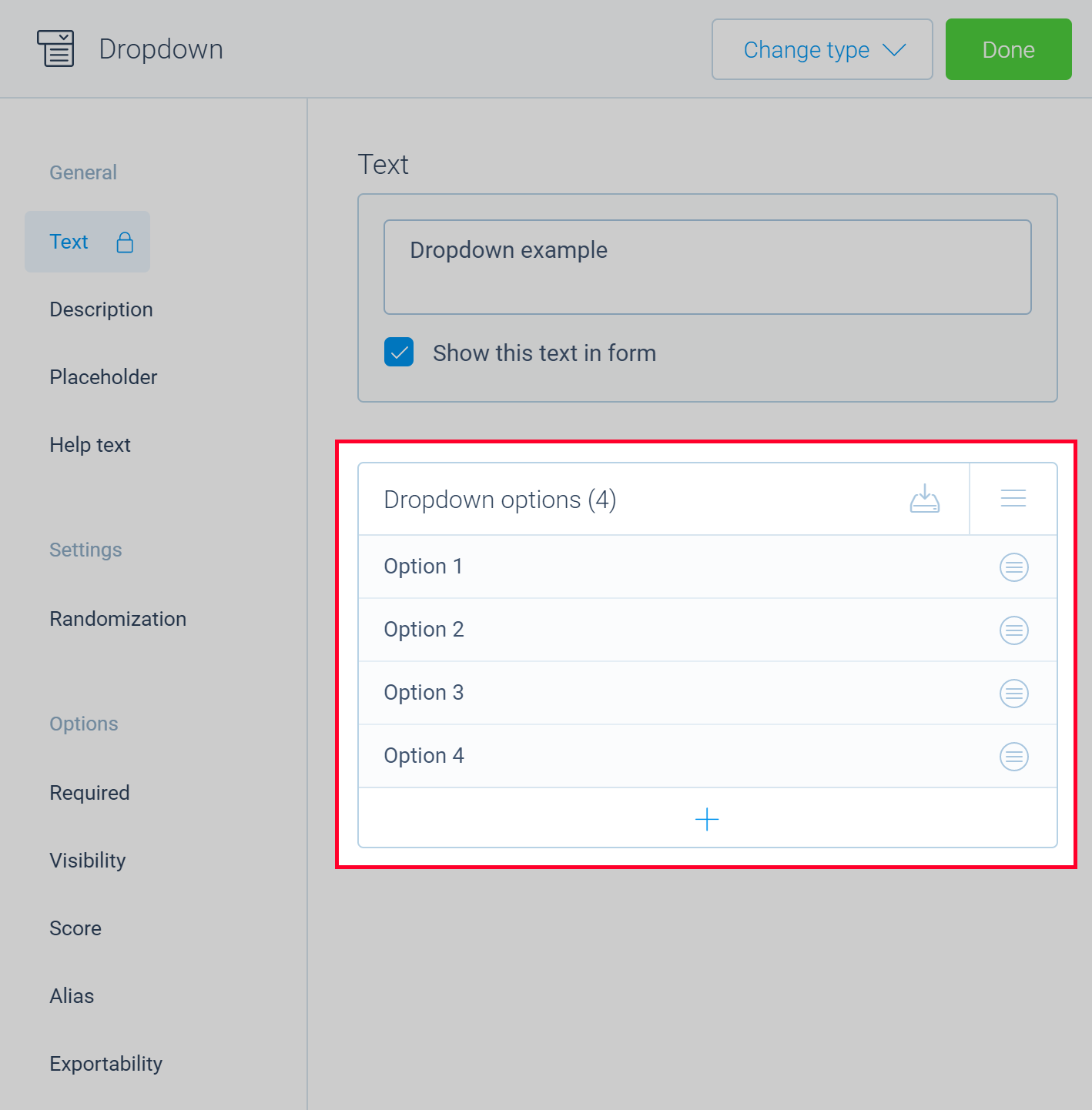
📒 Adding a collection feature
Now we want to allow the builder user to manage the collection and to create new dropdown options. To do that, we need to define a block editor and add a collection feature for managing the collection. Let's create an editor panel for the block by adding a method, decorating it with the @editor decorator, and then implementing the collection feature:
import { tripetto, definition, name, editor, Collection, NodeBlock } from "@tripetto/builder";

class DropdownOption extends Collection.Item<Dropdown> {
  @definition
  @name
  name = "";

  @definition
  alias?: string;
}

@tripetto({
  type: "node",
  identifier: "dropdown",
  label: "Dropdown",
  icon: "data:image/svg+xml;base64,PHN2ZyAvPg=="
})
class Dropdown extends NodeBlock {
  options = Collection.of<DropdownOption, Dropdown>(DropdownOption, this);

  @editor
  onEdit(): void {
    this.editor.collection({
      collection: this.options,
      title: "Dropdown options",
      placeholder: "Unnamed option",
      sorting: "manual",
      editable: true,
      emptyMessage: "Click the + button to add an option..."
    });
  }
}
The builder user can now add new options to the list of dropdown options. An option that doesn't have a name yet is listed as Unnamed option in the list (as specified by the placeholder). By setting sorting to manual we indicate that the builder user can sort this list by dragging and dropping items to the desired position. editable is set to true to allow the builder user to edit the name of an item by double-tapping on it.
📝 Adding an item editor
The last step is to define an editor panel for the dropdown options itself. Since we defined two fields in the DropdownOption class, we want to be able to manage these fields. The procedure for adding an editor panel to a collection item is identical to that for the blocks. Just add a method and decorate it with the @editor decorator, as shown in the following example:
import { tripetto, definition, name, editor, isString, Collection, NodeBlock } from "@tripetto/builder";

class DropdownOption extends Collection.Item<Dropdown> {
  @definition
  @name
  name = "";

  @definition
  alias?: string;

  @editor
  onEdit(): void {
    this.editor.option({
      name: "Name",
      form: {
        title: "Option name",
        controls: [
            new Forms.Text(
              "singleline",
              Forms.Text.bind(this, "name", "")
            )
        ]
      },
      locked: true,
    });

    this.editor.option({
      name: "Alias",
      form: {
        title: "Alias",
        controls: [
          new Forms.Text(
            "singleline",
            Forms.Text.bind(this, "alias", undefined)
          ),
        ],
      },
      activated: isString(this.value),
    });
  }
}

@tripetto({
  type: "node",
  identifier: "dropdown",
  label: "Dropdown",
  icon: "data:image/svg+xml;base64,PHN2ZyAvPg=="
})
class Dropdown extends NodeBlock {
  options = Collection.of<DropdownOption, Dropdown>(DropdownOption, this);

  @editor
  onEdit(): void {
    this.editor.collection({
      collection: this.options,
      title: "Dropdown options",
      placeholder: "Unnamed option",
      sorting: "manual",
      editable: true,
      emptyMessage: "Click the + button to add an option..."
    });
  }
}
And now we have a full working example for a dropdown block. The builder user can add new dropdown options and then open the editor panel for each option to manage the name and alias.
If you want, you can add type guards. See the Block properties guide for more information.
🗃️ Using item slots
Sometimes you want to add a (dynamic) slot for each item. This is possible using the available collection item decorators. In most situations, you want to create a slot when an item is created. The slot probably has the name of the item as its label. So you want to update the slot label when the item is renamed. When an item is deleted from the collection, the slot of the item should be removed as well. Therefore we are going to use the @created, @renamed and @deleted decorators as shown in the following example:
import { tripetto, definition, name, editor, created, renamed, deleted, isString, Collection, NodeBlock } from "@tripetto/builder";

class Checkbox extends Collection.Item<Checkboxes> {
  @definition
  @name
  name = "";

  @created
  @renamed
  addSlot(): void {
    this.ref.slots.dynamic({
      type: Slots.Boolean,
      reference: this.id,
      label: "Checkbox",
      name: this.name
    });
  }

  @deleted
  deleteSlot(): void {
    this.ref.slots.delete(this.id, "dynamic");
  }
}

@tripetto({
  type: "node",
  identifier: "checkboxes",
  label: "Checkboxes",
  icon: "data:image/svg+xml;base64,PHN2ZyAvPg=="
})
class Checkboxes extends NodeBlock {
  checkboxes = Collection.of<Checkbox, Checkboxes>(Checkbox, this);

  @editor
  onEdit(): void {
    this.editor.collection({
      collection: this.checkboxes,
      title: "Checkboxes",
      placeholder: "Unnamed checkbox",
      sorting: "manual",
      editable: true,
      emptyMessage: "Click the + button to add a checkbox..."
    });
  }
}
In this example, the addSlot method is invoked whenever an item is created or renamed. The id of the item is used as slot reference. When a slot already exists, it updates/overwrites the supplied properties. So we can safely call addSlot when the item is renamed. When the item is deleted from a collection, the method deleteSlot is called, which removes the slot from the slot collection. The ref field of the item is used to retrieve a reference to the parent NodeBlock instance.
🖼️ Adding an item icon
If you want, you can set an icon for an item. The icon is shown in the collection list in the block editor. To define an icon, simply add a field for it and decorate it with the @icon decorator:
import { tripetto, definition, name, icon, Collection } from "@tripetto/builder";

class DropdownOption extends Collection.Item<Dropdown> {
  @icon
  readonly icon = "data:image/svg+xml;base64,PHN2ZyAvPg==";

  @definition
  @name
  name = "";
}