Block icon
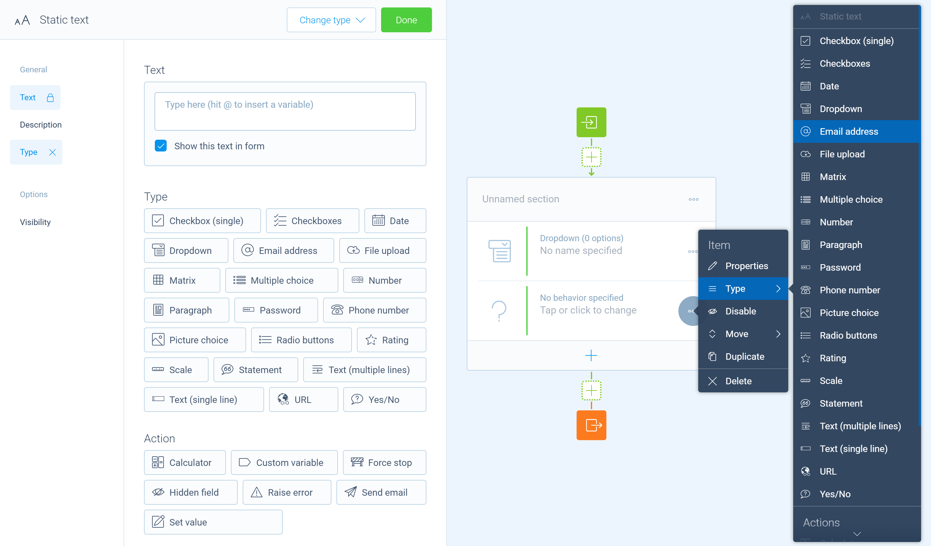
The block icon is used in the builder as a visual indication for the blocks. It is supplied by the builder part of a block in the block register decorator @tripetto. The icon is used in multiple locations in the builder, as you can see in the screenshot below:
You may have noticed that the icon is rendered in different colors depending on the occasion. To make this possible, it is necessary to follow two guidelines for the icon.
1️⃣ Guideline 1
Supply the icon as a Base64 encoded SVG image instead of a URL. The code of a Base64 encoded image is a string and looks something like this:
data:image/svg+xml;base64,PHN2ZyAvPg==
Make sure to always include the data:image/svg+xml;base64, part.
Supply as string
You can supply such a string directly to the icon property of the @tripetto decorator, as shown in the following example:
import { tripetto, NodeBlock } from "@tripetto/builder";

@tripetto({
  type: "node",
  identifier: "example",
  label: "Example",
  icon: "data:image/svg+xml;base64,PHN2ZyAvPg=="
})
class ExampleBlock extends NodeBlock {}
Supply using webpack
When using webpack, you can also configure it to process SVG images automatically and encode them. This makes it possible to directly import an SVG image in the source file of the block. It keeps your code tidy. To use that, you need to add the packages image-webpack-loader and url-loader to your project:
- npm
- Yarn
- pnpm
npm install image-webpack-loader url-loader
yarn add image-webpack-loader url-loader
pnpm add image-webpack-loader url-loader
After that, you need to update your webpack configuration and add the highlighted lines:
module.exports = {
  module: {
    rules: [
      {
        test: /\.svg$/,
        use: ["url-loader", "image-webpack-loader"],
      },
    ],
  },
};
And then, you can import the icon directly, as shown in the following example:
import { tripetto, NodeBlock } from "@tripetto/builder";
import icon from "./icon.svg";

@tripetto({
  type: "node",
  identifier: "example",
  label: "Example",
  icon
})
class ExampleBlock extends NodeBlock {}
2️⃣ Guideline 2
The second guideline is to customize the SVG image so Tripetto can control its primary color. You can apply specific classes to the class attribute of elements in your SVG image to do so. There are two classes available:
tripetto-fill: Changes the fill color of an element;tripetto-stroke: Changes the stroke color of an element.
For both classes, the same color is applied. So this works best with images that only need one color (like the icons we use for our stock blocks).
Example
In this example, the defined stroke color in the SVG image is blue. But because the class tripetto-stroke is applied, Tripetto can now change that color into something else during runtime.
<svg viewBox="0 0 10 10" xmlns="http://www.w3.org/2000/svg">
  <circle cx="5" cy="5" r="4" stroke="blue" class="tripetto-stroke" />
</svg>