Block editor
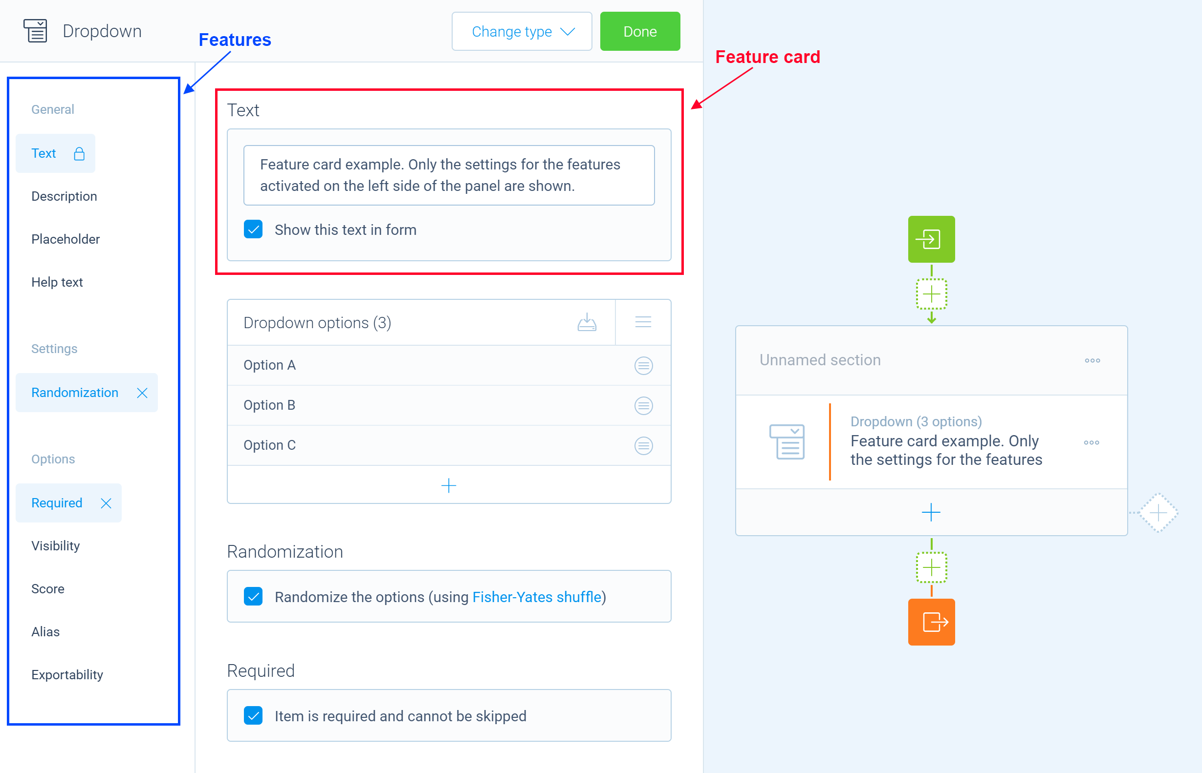
Tripetto uses editor panels for managing the properties of blocks. Editor panels slide into view whenever the user wants to edit the properties of a block. The editor panel itself consists of two parts. The features part on the left side contains a list of all features that can be activated (or deactivated) for a block. The right side of the editor panel contains the feature cards for all activated features. Each feature card holds the settings for that particular feature. The idea behind this concept is to keep the screen as tidy as possible by only showing the relevant settings.
To define the features of an editor panel, you need to add a method to your block class. This method needs to be decorated with the @editor decorator. This instructs the builder to invoke the method whenever it needs the editor panel for a block or item. Here is an example of what that looks like in your code:
import { tripetto, editor, NodeBlock } from "@tripetto/builder";

@tripetto({
  type: "node",
  identifier: "example",
  label: "Example block",
  icon: "data:image/svg+xml;base64,PHN2ZyAvPg=="
})
class ExampleBlock extends NodeBlock {
  @editor
  onEdit(): void {
    this.editor.groups.general();
    this.editor.name();
    this.editor.description();
  }
}
You can use the editor field of a the block to specify features for the editor panel. There a ready-made feature cards available for common used features, like the name and description of a block. But you can also define custom feature cards for managing the properties of a certain feature.
🗂️ Common used feature cards
alias: Adds the alias feature that manages thealiasproperty of an object;description: Adds the description feature which manages thedescriptionproperty of aNode;collection: Adds a collection control that can manage the items in a collection;explanation: Adds the explanation feature which manages theexplanationproperty of aNode;exportable: Adds the exportable feature that manages theexportableproperty of an object;form: Adds a custom form with an invisible feature;group: Adds a group label in the features list;groups: Contains croup templates with common used groups titles;name: Adds the name feature which manages thenameproperty of aNode;numeric: Adds a numeric feature;option: Adds an optional feature with a form or collection;placeholder: Adds the placeholder feature which manages theplaceholderproperty of aNode;required: Adds the required feature that manages therequiredproperty of an object;scores: Adds the scores feature;transformations: Adds the transformations feature that manages thetransformationproperty of an object;visibility: Adds the visibility feature which manages thedisabledproperty of aNode.
👩💻 Custom features
You can define custom features to manage additional settings for a block.
Toggleable features
Toggleable features are features that can be activated or deactivated by the builder user. They are used for managing optional settings for a block. Use the option method to define a new feature. You can specify a form or a collection as a feature card. For example:
import { tripetto, editor, isBoolean, NodeBlock } from "@tripetto/builder";

@tripetto({
  type: "node",
  identifier: "example-block",
  label: "Example",
  icon: "data:image/svg+xml;base64,PHN2ZyAvPg=="
})
class ExampleBlock extends NodeBlock {
  @definition
  example?: boolean;

  @editor
  onEdit(): void {
    this.editor.option({
      // The feature is activated when `example` is a valid boolean value
      activated: isBoolean(this.example),
      name: "Example feature",
      form: {
        title: "Feature for managing the optional example field",
        controls: [
          new Forms.Checkbox(
            "Example checkbox",
            // When the feature is activated and `example` is undefined, its initial value is set to `true`
            Forms.Checkbox.bind(this, "example", undefined, true)
          )
        ]
      }
    });
  }
}
Fixed form cards
If you want to add a fixed form (without a toggleable feature), you can use the form method to define a fixed feature card. Fixed cards are not listed in the features list on the left side of an editor panel. Here is an example:
import { tripetto, editor, NodeBlock } from "@tripetto/builder";

@tripetto({
  type: "node",
  identifier: "example-block",
  label: "Example",
  icon: "data:image/svg+xml;base64,PHN2ZyAvPg=="
})
class ExampleBlock extends NodeBlock {
  @definition
  example: boolean;

  @editor
  onEdit(): void {
    this.editor.form({
      title: "Toggle the example property",
      controls: [
        new Forms.Checkbox(
          "Example checkbox",
          Forms.Checkbox.bind(this, "example", false)
        )
      ]
    });
  }
}
Form controls
When you define a form card, you can choose from the following form controls:
Button: Defines a button for a form;Checkbox: Defines a checkbox control for a form;ColorPicker: Defines a color picker control for a form;DateTime: Defines a date/time control for a form;Dropdown: Defines a dropdown control for a form;Email: Defines an email address input control for a form;Group: Defines a group of controls for a form;HTML: Defines static HTML for a form;Notification: Defines a notification bar for a form;Numeric: Defines a number input control for a form;Radiobutton: Defines a radio button control for a form;Spacer: Defines a spacer for a form to add space between two controls;Static: Defines static text for a form;Text: Defines a text input control for a form.