Radiobutton class
📖 Description
The Radiobutton class defines a radiobutton control for the Tripetto builder. It is derived from the DataControl class.
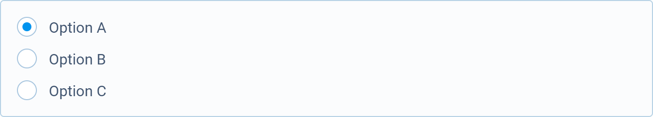
📺 Preview
🆕 constructor
Creates a new Radiobutton instance.
Signature
constructor(buttons: IButton[], value: any | Binding, style?: IRadiobuttonStyle): Radiobutton
Parameters
| Name | Type | Optional | Description |
|---|---|---|---|
buttons | IButton[] | No | Specifies the radiobuttons. |
value | any | Binding | No | Specifies the initially selected value or a data binding created with bind. |
style | IRadiobuttonStyle | Yes | Specifies the style (when omitted the default global style will be used). |
Return value
Returns a reference to the new Radiobutton instance.
📌 Statics
🏷️ style
Contains the global default style for the radiobutton control.
Type
🔧 bind
Binds an object property to the control allowing its value to update automatically when the value of the control changes. If the control is disabled or invisible, the supplied valueWhenInactive is automatically set as the property value. When a control is enabled and visible, the supplied defaultWhenActive is set automatically if the property value is currently not defined.
Signature
bind<Target, P extends keyof Target>(
  target: Target,
  property: P,
  valueWhenInactive: any,
  defaultWhenActive?: any,
  modifier?: (value?: any) => any
): Binding;
Parameters
| Name | Type | Optional | Description |
|---|---|---|---|
target | Target | No | Reference to the target object which contains the property. |
property | P | No | Specifies the name of the property. |
valueWhenInactive | any | No | Specifies the value which is set to the property when the control is inactive (disabled or invisible). |
defaultWhenActive | any | Yes | Specifies the default (initial) value that will be used when the control is active (enabled and visible). |
modifier | (value?: any) => any | Yes | Specifies a modifier function for the data. |
Return value
Returns a Binding instance that can be used in the controls constructor to bind a value to a control.
Example
import { Forms } from "@tripetto/builder";

const example = {
  selected: "a"
};

const radiobutton = new Forms.Radiobutton(
  [
    {
      label: "Option A",
      value: "a"
    },
    {
      label: "Option B",
      value: "b"
    },
    {
      label: "Option C",
      value: "c"
    }
  ],
  Forms.Radiobutton.bind(example, "selected", "a"));
🗃️ Fields
🏷️ hasFocus
Retrieves if the control has input focus.
Type
boolean
🏷️ isDisabled
Sets or retrieves if the control is disabled.
Type
boolean
🏷️ isLocked
Sets or retrieves if the control is locked (readonly).
Type
boolean
🏷️ isObservable
Retrieves if the control is observable.
Type
boolean
🏷️ isRequired
Sets or retrieves if the control is required.
Type
boolean
🏷️ isVisible
Sets or retrieves the visibility of the control.
Type
boolean
🏷️ style
Contains the radiobutton control style.
Type
🏷️ value
Sets or retrieves the selected value.
Type
any
▶️ Methods
🔧 blur
Blurs the focus of the control.
Signature
blur(): void
��🔧 buttonDescription
Retrieves or sets the description of the specified button or the current button if no button value is specified.
Signature
buttonDescription(value?: any, description?: string): string
Parameters
| Name | Type | Optional | Description |
|---|---|---|---|
value | any | Yes | Specifies the button value. |
description | string | Yes | Specifies a new description for the button. |
Return value
Returns the description.
🔧 buttonDisabled
Sets or retrieves the disabled state of the specified button (or the current button if no button value is specified).
Signature
buttonDisabled(value?: any, disabled?: boolean): boolean
Parameters
| Name | Type | Optional | Description |
|---|---|---|---|
value | any | Yes | Specifies the button value. |
disabled | boolean | Yes | Specifies the disabled state. |
Return value
Returns the disabled state.
🔧 buttonLabel
Retrieves or sets the label of the specified button or the current button if no button value is specified.
Signature
buttonLabel(value?: any, label?: string): string
Parameters
| Name | Type | Optional | Description |
|---|---|---|---|
value | any | Yes | Specifies the button value. |
label | string | Yes | Specifies a new label for the button. |
Return value
Returns the label.
🔧 buttonVisible
Sets or retrieves the visibility of the specified button (or the current button if no button value is specified).
Signature
buttonVisible(value?: any, visible?: boolean): boolean
Parameters
| Name | Type | Optional | Description |
|---|---|---|---|
value | any | Yes | Specifies the button value. |
visible | boolean | Yes | Specifies the visibility. |
Return value
Returns the visibility.
🔧 disable
Disables the control.
Signature
disable(): this
Return value
Returns a reference to the Dropdown instance to allow chaining.
🔧 disabled
Specifies the state of the control.
Signature
disabled(disabled?: boolean): this
Parameters
| Name | Type | Optional | Description |
|---|---|---|---|
disabled | boolean | Yes | Specifies if the control is disabled (default is true). |
Return value
Returns a reference to the Dropdown instance to allow chaining.
🔧 enable
Enables the control.
Signature
enable(): this
Return value
Returns a reference to the Dropdown instance to allow chaining.
🔧 focus
Sets the focus to the control.
Signature
focus(): boolean
Return value
Returns true if the focus is set.
🔧 hide
Hides the control.
Signature
hide(): this
Return value
Returns a reference to the Dropdown instance to allow chaining.
🔧 indent
Enables control indentation. This can only be set during construction.
Signature
indent(size: number): this
Parameters
| Name | Type | Optional | Description |
|---|---|---|---|
size | number | No | Specifies the indent size in pixels. |
Return value
Returns a reference to the Dropdown instance to allow chaining.
🔧 label
Sets the label for the control.
Signature
label(label: string): this
Parameters
| Name | Type | Optional | Description |
|---|---|---|---|
label | string | No | Specifies the control label. |
Return value
Returns a reference to the Dropdown instance to allow chaining.
🔧 lock
Locks the control.
Signature
lock(): this
Return value
Returns a reference to the Dropdown instance to allow chaining.
🔧 locked
Specifies if the control is locked (readonly).
Signature
locked(locked?: boolean): this
Parameters
| Name | Type | Optional | Description |
|---|---|---|---|
locked | boolean | Yes | Specifies if the control is locked/readonly (default is true). |
Return value
Returns a reference to the Dropdown instance to allow chaining.
🔧 markdown
Specifies if the label should support markdown formatting.
Signature
markdown(options?: IMarkdownOptions): this
Parameters
| Name | Type | Optional | Description |
|---|---|---|---|
options | IMarkdownOptions | Yes | Specifies the markdown options. |
Return value
Returns a reference to the Dropdown instance to allow chaining.
🔧 on
Specifies the function which is invoked when the radiobutton selection is changed.
Signature
on(fn: (pRadiobutton: Radiobutton) => void): this
Parameters
| Name | Type | Optional | Description |
|---|---|---|---|
fn | (pRadiobutton: Radiobutton) => void | No | Specifies the change function. |
Return value
Returns a reference to the Radiobutton instance to allow chaining.
🔧 readonly
Makes the control readonly.
Signature
readonly(): this
Return value
Returns a reference to the Dropdown instance to allow chaining.
🔧 require
Makes the control required.
Signature
require(): this
Return value
Returns a reference to the Dropdown instance to allow chaining.
🔧 required
Specifies if the control is required.
Signature
required(required?: boolean): this
Parameters
| Name | Type | Optional | Description |
|---|---|---|---|
required | boolean | Yes | Specifies if the control is required (default is true). |
Return value
Returns a reference to the Dropdown instance to allow chaining.
🔧 select
Selects the specified button.
Signature
select(value: any): this
Parameters
| Name | Type | Optional | Description |
|---|---|---|---|
value | any | No | Specifies the button value. |
Return value
Returns a reference to the Radiobutton instance to allow chaining.
🔧 show
Shows the control.
Signature
show(): this
Return value
Returns a reference to the Dropdown instance to allow chaining.
🔧 unlock
Unlocks the control.
Signature
unlock(): this
Return value
Returns a reference to the Dropdown instance to allow chaining.
🔧 visible
Specifies the visibility of the control.
Signature
visible(visible?: boolean): this
Parameters
| Name | Type | Optional | Description |
|---|---|---|---|
visible | boolean | Yes | Specifies if the control is visible (default is true). |
Return value
Returns a reference to the Dropdown instance to allow chaining.
⛓️ Interfaces
🔗 IRadiobuttonStyle
Describes the interface for the radiobutton styles.
Type declaration
interface IRadiobuttonStyle {
  /* Control appearance. */
  appearance?: IStyles;

  /* Radiobutton appearance. */
  radiobutton?: {
    /* Radiobutton label. */
    label?: IStyles;

    /* Checked state. */
    checked?: IStyles;

    /* Unchecked state. */
    unchecked?: IStyles;

    /* Radiobutton disabled. */
    disabled?: IRadiobuttonStyles;

    /* Radiobutton focus. */
    focus?: IRadiobuttonStyles;

    /* Radiobutton hover. */
    hover?: IRadiobuttonStyles;

    /* Radiobutton description. */
    description?: IStyles;
  };

  /* Control label. */
  label?: IStyles;

  /* Control disabled. */
  disabled?: IStyles;

  /* Control required. */
  required?: IStyles;

  /* Control locked. */
  locked?: IStyles;

  /* Validation passed. */
  passed?: IStyles;

  /* Validation failed. */
  failed?: IStyles;

  /* Validation awaiting. */
  awaiting?: IStyles;

  /* Radiobutton when fused with form card. */
  fused?: {
    /* Control appearance. */
    appearance?: IStyles;

    /* Control label. */
    label?: IStyles;

    /* Control required. */
    required?: IStyles;
  };
}
🔗 IButton
Describes the interface for a button.
Type declaration
interface IButton {
  /* Label for the button. */
  label: string;

  /* Value for the button. */
  value: any;

  /* Specifies if the button is disabled. */
  disabled?: boolean;

  /* Specifies if the button is visible. */
  visible?: boolean;

  /* Specifies an additional description for the button. */
  description?: string;

  /* Specifies if markdown is supported for the label and description. */
  markdown?: boolean | IMarkdownOptions;
}