ColorPicker class
📖 Description
The ColorPicker class defines a color input control for the Tripetto builder. It is derived from the DataControl class.
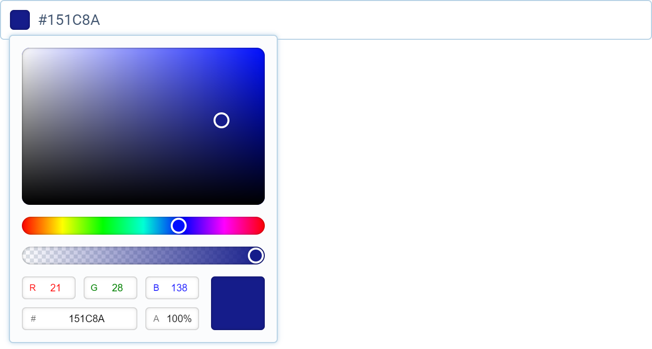
📺 Preview
🆕 constructor
Creates a new ColorPicker instance.
Signature
constructor(color?: string | Binding, style?: IColorPickerStyle): ColorPicker
Parameters
| Name | Type | Optional | Description |
|---|---|---|---|
color | string | Binding | Yes | Specifies the initially color or a data binding created with bind. |
style | IColorPickerStyle | Yes | Specifies the input style (when omitted the default global style will be used). |
Return value
Returns a reference to the new ColorPicker instance.
📌 Statics
🏷️ style
Contains the global default style for the color input control.
Type
🔧 bind
Binds an object property to the control allowing its value to update automatically when the value of the control changes. If the control is disabled or invisible, the supplied valueWhenInactive is automatically set as the property value. When a control is enabled and visible, the supplied defaultWhenActive is set automatically if the property value is currently not defined.
Signature
bind<Target, P extends keyof Target>(
  target: Target,
  property: P,
  valueWhenInactive: string,
  defaultWhenActive?: string,
  modifier?: (value?: string) => string
): Binding;
Parameters
| Name | Type | Optional | Description |
|---|---|---|---|
target | Target | No | Reference to the target object which contains the property. |
property | P | No | Specifies the name of the property. |
valueWhenInactive | string | No | Specifies the value which is set to the property when the control is inactive (disabled or invisible). |
defaultWhenActive | string | Yes | Specifies the default (initial) value that will be used when the control is active (enabled and visible). |
modifier | (value?: string) => string | Yes | Specifies a modifier function for the data. |
Return value
Returns a Binding instance that can be used in the controls constructor to bind a value to a control.
Example
import { Forms } from "@tripetto/builder";

const example = {
  color: ""
};

const colorPicker = new Forms.ColorPicker(Forms.ColorPicker.bind(example, "color", ""));
🗃️ Fields
🏷️ color
Sets or retrieves the color value.
Type
string
🏷️ hasFocus
Retrieves if the control has input focus.
Type
boolean
🏷️ isDisabled
Sets or retrieves if the control is disabled.
Type
boolean
🏷️ isLocked
Sets or retrieves if the control is locked (readonly).
Type
boolean
🏷️ isObservable
Retrieves if the control is observable.
Type
boolean
🏷️ isRequired
Sets or retrieves if the control is required.
Type
boolean
🏷️ isVisible
Sets or retrieves the visibility of the control.
Type
boolean
🏷️ style
Contains the text control style.
Type
🏷️ value
Sets or retrieves the color value.
Type
string
▶️ Methods
🔧 autoValidate
Enables automatic control validation.
Signature
autoValidate(): this
Return value
Returns a reference to the ColorPicker instance to allow chaining.
🔧 blur
Blurs the focus of the control.
Signature
blur(): void
🔧 disable
Disables the control.
Signature
disable(): this
Return value
Returns a reference to the ColorPicker instance to allow chaining.
🔧 disabled
Specifies the state of the control.
Signature
disabled(disabled?: boolean): this
Parameters
| Name | Type | Optional | Description |
|---|---|---|---|
disabled | boolean | Yes | Specifies if the control is disabled (default is true). |
Return value
Returns a reference to the ColorPicker instance to allow chaining.
🔧 enable
Enables the control.
Signature
enable(): this
Return value
Returns a reference to the ColorPicker instance to allow chaining.
🔧 escape
Specifies the function which is invoked when the user presses the escape key.
Signature
escape(fn: (colorPicker: ColorPicker) => boolean): this
Parameters
| Name | Type | Optional | Description |
|---|---|---|---|
fn | (colorPicker: ColorPicker) => boolean | No | Specifies the function to invoke. To cancel the normal behavior return true within the function. |
Return value
Returns a reference to the ColorPicker instance to allow chaining.
🔧 focus
Sets the focus to the control.
Signature
focus(): boolean
Return value
Returns true if the focus is set.
🔧 format
Specifies the color format to use.
See https://developer.mozilla.org/en-US/docs/Web/CSS/color_value for more information about color models.
Signature
format(format: "auto" | "hex" | "hex-unsigned" | "rgb" | "hsl" | "hwb"): this
Parameters
| Name | Type | Optional | Description |
|---|---|---|---|
format | "auto" | "hex" | "hex-unsigned" | "rgb" | "hsl" | "hwb" | No | Specifies the color format to use. Can be one of the following values: - auto: Allows any valid color notation;- hex: Uses hex notation;- rgb: Uses RGB notation;- hsl: Uses HSL notation;- hwb: Uses HWB notation;- hex-unsigned: Uses hex notation without the hash sign. |
Return value
Returns a reference to the ColorPicker instance to allow chaining.
🔧 hide
Hides the control.
Signature
hide(): this
Return value
Returns a reference to the ColorPicker instance to allow chaining.
🔧 indent
Enables control indentation. This can only be set during construction.
Signature
indent(size: number): this
Parameters
| Name | Type | Optional | Description |
|---|---|---|---|
size | number | No | Specifies the indent size in pixels. |
Return value
Returns a reference to the ColorPicker instance to allow chaining.
🔧 label
Sets the label for the control.
Signature
label(label: string): this
Parameters
| Name | Type | Optional | Description |
|---|---|---|---|
label | string | No | Specifies the control label. |
Return value
Returns a reference to the ColorPicker instance to allow chaining.
🔧 labels
Specifies the labels for the color picker panel.
Signature
labels(labels: {
    palette: string;
    history: string;
}): this
Parameters
| Name | Type | Optional | Description |
|---|---|---|---|
labels | object | No | Specifies the labels. |
Return value
Returns a reference to the ColorPicker instance to allow chaining.
🔧 lock
Locks the control.
Signature
lock(): this
Return value
Returns a reference to the ColorPicker instance to allow chaining.
🔧 locked
Specifies if the control is locked (readonly).
Signature
locked(locked?: boolean): this
Parameters
| Name | Type | Optional | Description |
|---|---|---|---|
locked | boolean | Yes | Specifies if the control is locked/readonly (default is true). |
Return value
Returns a reference to the ColorPicker instance to allow chaining.
🔧 markdown
Specifies if the label should support markdown formatting.
Signature
markdown(options?: IMarkdownOptions): this
Parameters
| Name | Type | Optional | Description |
|---|---|---|---|
options | IMarkdownOptions | Yes | Specifies the markdown options. |
Return value
Returns a reference to the ColorPicker instance to allow chaining.
🔧 on
Specifies the function which is invoked when the input value changes.
Signature
on(fn: (colorPicker: ColorPicker) => void): this
Parameters�
| Name | Type | Optional | Description |
|---|---|---|---|
fn | (colorPicker: ColorPicker) => void | No | Specifies the change function. |
Return value
Returns a reference to the ColorPicker instance to allow chaining.
🔧 placeholder
Sets a placeholder for the input control.
Signature
placeholder(placeholder: string): this
Parameters
| Name | Type | Optional | Description |
|---|---|---|---|
placeholder | string | No | Specifies the placeholder text. |
Return value
Returns a reference to the ColorPicker instance to allow chaining.
🔧 readonly
Makes the control readonly.
Signature
readonly(): this
Return value
Returns a reference to the ColorPicker instance to allow chaining.
🔧 require
Makes the control required.
Signature
require(): this
Return value
Returns a reference to the ColorPicker instance to allow chaining.
🔧 required
Specifies if the control is required.
Signature
required(required?: boolean): this
Parameters
| Name | Type | Optional | Description |
|---|---|---|---|
required | boolean | Yes | Specifies if the control is required (default is true). |
Return value
Returns a reference to the ColorPicker instance to allow chaining.
🔧 select
Selects the current value.
Signature
select(): this
Return value
Returns a reference to the ColorPicker instance to allow chaining.
🔧 show
Shows the control.
Signature
show(): this
Return value
Returns a reference to the ColorPicker instance to allow chaining.
🔧 supportAlpha
Specifies if alpha values for transparency are supported.
Alpha value support is enabled by default. If you don't want translucent colors, you need to disable it with this function.
Signature
supportAlpha(supportAlpha: boolean): this
Parameters
| Name | Type | Optional | Description |
|---|---|---|---|
supportAlpha | boolean | No | Specifies if alpha values are supported. |
Return value
Returns a reference to the ColorPicker instance to allow chaining.
🔧 swatches
Specifies if color swatches are generated and shown. Color swatches are color presets that are shown in the color picker overlay. The color palette swatches are generated using all color picker controls in a form. The history keeps track of all previously used colors.
Signature
swatches(
  palette?: boolean,
  history?: boolean,
  sorting?: "auto" | "hue" | "rgb"
): this
Parameters
| Name | Type | Optional | Description |
|---|---|---|---|
palette | boolean | Yes | Specifies if a color palette is generated (default is true). |
history | boolean | Yes | Specifies if the color history is enabled (default is true). |
sorting | "auto" | "hue" | "rgb" | Yes | Specifies how the palette swatches are sorted. Can be one of the following values: - auto: Swatches are sorted by order of use;- hue: Swatches are sorted on the hue value;- rgb: Swatches are sorted on the RGB value. |
Return value
Returns a reference to the ColorPicker instance to allow chaining.
🔧 unlock
Unlocks the control.
Signature
unlock(): this
Return value
Returns a reference to the ColorPicker instance to allow chaining.
🔧 visible
Specifies the visibility of the control.
Signature
visible(visible?: boolean): this
Parameters
| Name | Type | Optional | Description |
|---|---|---|---|
visible | boolean | Yes | Specifies if the control is visible (default is true). |
Return value
Returns a reference to the ColorPicker instance to allow chaining.
🔧 width
Sets the width of the control.
Signature
width(width: number): this
Parameters
| Name | Type | Optional | Description |
|---|---|---|---|
width | number | No | Specifies the control width in pixels. |
Return value
Returns a reference to the ColorPicker instance to allow chaining.
⛓️ Interfaces
🔗 IColorPickerStyle
Describes the interface for the color picker styles.
Type declaration
interface IColorPickerStyle {
  /* Color picker input appearance. */
  appearance?: IStyles;

  /* Color picker input label. */
  label?: IStyles;

  /* Color picker input field. */
  input?: IStyles;

  /* Color picker panel. */
  picker?: {
    /* Color picker panel appearance. */
    appearance?: IStyles;

    /* Specifies the horizontal padding in pixels. */
    horizontalPadding?: number;

    /* Specifies the horizontal padding in pixels. */
    verticalPadding?: number;

    /* Specifies the spacing in pixels. */
    spacing?: Spacing;
  };

  /* Color picker input disabled. */
  disabled?: IStyles;

  /* Placeholder style. */
  placeholder?: IStyles;

  /* Contains the text selection styles. */
  selection?: IStyles;

  /* Color picker input required. */
  required?: IStyles;

  /* Color picker input locked. */
  locked?: IStyles;

  /* Color picker input focus. */
  focus?: IStyles;

  /* Color picker input hover. */
  hover?: IStyles;

  /* Validation passed. */
  passed?: IStyles;

  /* Validation failed. */
  failed?: IStyles;

  /* Validation awaiting. */
  awaiting?: IStyles;

  /* Color picker input when fused with form card. */
  fused?: {
    /* Color picker input appearance. */
    appearance?: IStyles;

    /* Color picker input label. */
    label?: IStyles;

    /* Color picker input required. */
    required?: IStyles;

    /* Color picker input locked. */
    locked?: IStyles;

    /* Color picker input focus. */
    focus?: IStyles;

    /* Color picker input hover. */
    hover?: IStyles;

    /* Validation passed. */
    passed?: IStyles;

    /* Validation failed. */
    failed?: IStyles;

    /* Validation awaiting. */
    awaiting?: IStyles;
  };
}