Collection module
📖 Description
The Collection module contains classes and controls to define item collections in the builder. Item collections are used to enable the user to create lists with items of a certain type. For example, options in a dropdown list.
See the Collections guide for more information.
💎 Classes
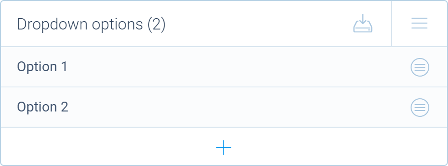
📺 Preview
▶️ Functions
🔧 find
Finds the collection that serves the list of possible values for a certain slot. For example, let's say you have a dropdown block with a collection that contains all the possible dropdown options and a single slot that holds the selected option for the dropdown. This function can retrieve a reference to the collection Provider for that slot.
Signature
find(slot: ISlotIdentifier): ICollectionSupply | undefined
Parameters
| Name | Type | Optional | Description |
|---|---|---|---|
slot | ISlotIdentifier | No | Specifies the slot to find the collection for. |
Return value
Returns a ICollectionSupply object or undefined if the collection was not found.
🔧 get
Retrieves the collection with the specified property name from a NodeBlock.
Signature
get(block: NodeBlock, name: string): Provider | undefined
Parameters
| Name | Type | Optional | Description |
|---|---|---|---|
block | NodeBlock | No | Reference to the node block to search in. |
name | string | No | The name of the property that holds the collection. |
Return value
Returns a reference to the Provider instance or undefined if the collection was not found.
🔧 of
Creates a new collection of the supplied item type class. The type class needs to be derived from the Item class. This function returns a reference to the Provider that provides access to the collection in the builder.
Collections are automatically saved to and retrieved from the form definition (as if the collection field was decorated with the @definition decorator).
Signature
of(constructor: typeof Item, reference: NodeBlock | ConditionBlock | Item): Provider
Parameters
| Name | Type | Optional | Description |
|---|---|---|---|
constructor | typeof Item | No | Specifies the type of items for the collection. |
reference | NodeBlock | ConditionBlock | Item | No | A reference to the parent instance that holds the collection. This reference is exposed to the ref property of the Item. |
Return value
Returns a reference to the Provider instance.
Example
import { _, tripetto, definition, name, Collection, NodeBlock } from "@tripetto/builder";

// Let's define an item type that holds an option for a dropdown list
class DropdownOption extends Collection.Item<Dropdown> {
  @definition
  @name
  name = "";
}

@tripetto({
  type: "node",
  identifier: "dropdown",
  label: "Dropdown",
  icon: "data:image/svg+xml;base64,PHN2ZyAvPg=="
})
class Dropdown extends NodeBlock {
  // Create a collection of dropdown options
  options = Collection.of<DropdownOption, Dropdown>(DropdownOption, this);
}
⛓️ Interfaces
🔗 IProperties
Describes the interface for declaring a collection card using the collection method of the EditorOrchestrator class for defining editor panels.
Type declaration
interface IProperties {
  collection: Provider;
  title: string;
  banner?: string;Optional
  sorting?: "ascending" | "descending" | "manual";Optional
  placeholder?: string;Optional
  emptyMessage?: string | {
    message: string;
    height: number;
  };Optional
  icon?: boolean | string;Optional
  editable?: boolean;Optional
  autoOpen?: boolean;Optional
  allowAutoSorting?: boolean;Optional
  allowCleanup?: boolean | string;Optional
  allowVariables?: boolean;Optional
  allowFormatting?: boolean;Optional
  allowImport?: boolean;Optional
  allowExport?: boolean;Optional
  allowDedupe?: boolean;Optional
  showAliases?: boolean | ((item: Item) => string | undefined);Optional
  showScores?: boolean | ((item: Item) => number | string | undefined);Optional
  markdown?: MarkdownFeatures;Optional
  menu?: MenuOption[] | (() => MenuOption[]);Optional
  width?: number;Optional
  indicator?: (item: Item) => string | undefined;FunctionOptional
  onAdd?: (item: Item) => void;EventOptional
  onRename?: (item: Item) => void;EventOptional
  onReposition?: (item: Item) => void;EventOptional
  onResize?: (collection: Provider) => void;EventOptional
  onDelete?: (item: Item) => void;EventOptional
  onOpen?: (item: Item) => void;EventOptional
  onClose?: (item: Item) => void;EventOptional
}
🏷️ allowAutoSorting
Specifies if the option to automatically sort the list is shown (enabled by default).
This only applies to collection cards with sorting set to manual.
Type
boolean
🏷️ allowCleanup
Specifies if the option to delete all unnamed items is shown (enabled by default). When a string is supplied the option is enabled and that string is shown as menu option to execute the cleanup.
Type
boolean | string
🏷️ allowDedupe
Specifies if the deduplication function is allowed. Deduplication deletes items with the same name.
Type
boolean
🏷️ allowExport
Specifies if the bulk item exporter is allowed.
Type
boolean
🏷️ allowFormatting
Specifies if markdown formatting is rendered in the list.
Type
boolean
🏷️ allowImport
Specifies if the bulk item importer is allowed.
Type
boolean
🏷️ allowVariables
Specifies if the use of variables (recalling values) is supported.
Type
boolean
🏷️ autoOpen
Specifies whether to open the editor panel of new items when they are added.
Type
boolean
🏷️ banner
Specifies a banner for collection card. The banner is shown above the card.
Type
string
🏷️ collection
Reference to the collection Provider instance.
Type
🏷️ editable
Specifies if the name of the items can be edited in the list by double tapping on the name.
Type
boolean
🏷️ emptyMessage
Specifies the message that is shown when the collection is empty.
Type
string | {
  /* Specifies the message to show. */
  message: string;

  /* Specifies the height of the collection card in pixels when the message is shown. */
  height: number;
}
🏷️ icon
Specifies if an icon is shown for each item (a default icon can be supplied). The Item property that is decorated with the @icon decorator is used as icon for the item.
Type
boolean | string | SVGImage
🏷️ indicator
Specifies an indicator for each Item that is shown in the collection card.
Type
(item: Item) => string | undefined
🏷️ markdown
Specifies the markdown features that are enabled when allowFormatting is set to true.
Type
🏷️ menu
Specifies a menu that is shown when the user wants to add something to the collection.
Type
MenuOption[] | (() => MenuOption[])
🏷️ placeholder
Specifies the placeholder for unnamed items.
Type
string
🏷️ showAliases
Specifies to show aliases. If this property is set to true it will use the Item property that is decorated with the @alias decorator. A function can be supplied to return an alternative alias for an Item.
Type
boolean | ((item: Item) => string | undefined)
🏷️ showScores
Specifies to show the score of an item. If this property is set to true it will use the Item property that is decorated with the @score decorator. A function can be supplied to return an alternative score for an Item.
Type
boolean | ((item: Item) => number | string | undefined)
🏷️ sorting
Specifies the collection sorting type (defaults to manual). In manual mode, the user can rearrange the list using drag and drop.
Type
"ascending" | "descending" | "manual"
🏷️ title
Title for the collection card. The title is shown inside the collection card.
If you want to have a title above the card, use the banner property.
Type
string
🏷️ width
Specifies the width if the item editor panel. Can be overruled per item with the @width decorator.
Type
number
🔔 onAdd
Invoked when an item is added to the collection.
Signature
(item: Item) => void
Parameters
| Name | Type | Optional | Description |
|---|---|---|---|
item | Item | No | Reference to the new item. |
🔔 onClose
Invoked when the editor panel of an item is closed.
Signature
(item: Item) => void
Parameters
| Name | Type | Optional | Description |
|---|---|---|---|
item | Item | No | Reference to the item. |
🔔 onDelete
Invoked when an item is removed from the collection.
Signature
(item: Item) => void
Parameters
| Name | Type | Optional | Description |
|---|---|---|---|
item | Item | No | Reference to the deleted item. |
🔔 onOpen
Invoked when the editor panel of an item is opened.
Signature
(item: Item) => void
Parameters
| Name | Type | Optional | Description |
|---|---|---|---|
item | Item | No | Reference to the item. |
🔔 onRename
Invoked when the name of the item is changed.
Signature
(item: Item) => void
Parameters
| Name | Type | Optional | Description |
|---|---|---|---|
item | Item | No | Reference to the changed item. |
🔔 onReposition
Invoked when the position of the item is changed.
Signature
(item: Item) => void
Parameters
| Name | Type | Optional | Description |
|---|---|---|---|
item | Item | No | Reference to the changed item. |
🔔 onResize
Invoked when the number of items in the collection has changed.
Signature
(collection: Provider) => void
Parameters
| Name | Type | Optional | Description |
|---|---|---|---|
collection | Provider | No | Reference to the collection provider. |
🔗 ICollectionSupply
Describes the interface for a collection supply returned by the find function.
Type declaration
interface ICollectionSupply {
  name: string;Readonly
  collection: Provider;Readonly
  origin: boolean;Readonly
  sole: boolean;Readonly
}
🏷️ collection
Contains a reference to the collection Provider instance.
Type
🏷️ name
Contains the name of the collection property in the NodeBlock derived class.
Type
string
🏷️ origin
Specifies if the collection is the origin for the slot. This means the slot is created/maintained by the collection. For example, you have a multiple choice block where the choices are maintained using a collection. For each choice, a
Type
boolean
🏷️ sole
Specifies if the collection is the sole supplier of values for the slot. For example, if your slot is used for a fixed dropdown list and the dropdown options are supplied by the collection, that collection is the sole supplier of possible values for the slot. If your slot is used for a text field with autocomplete suggestions and the collection is the supplier for the suggestions, the collection is not the sole supplier, because the respondent can also specify another value that is not in the collection list.
Type
boolean