The journey of Tripetto
Today we’re excited to launch Tripetto, our full-fledged SDK, on Product Hunt.
❌ This is a deprecated SDK blog article
Please note that the SDK concepts and code snippets in this article are about a deprecated version of the Tripetto SDK. In the meantime the SDK has evolved heavingly. For up-to-date SDK documentation, please have a look at the following links:
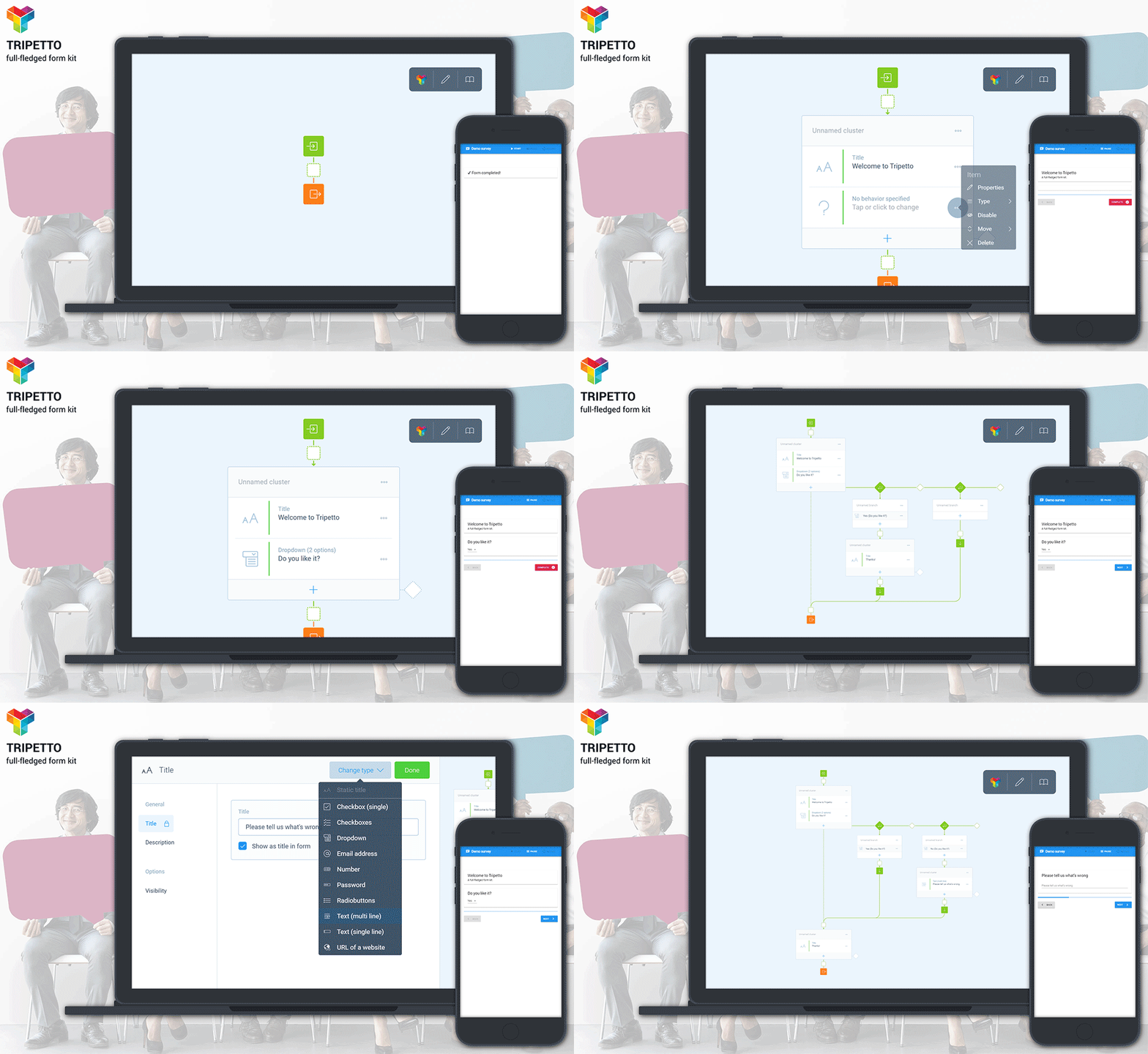
The SDK offers a beautiful, simple way for developers to build rich forms and surveys into their own applications — without being dependent on hosted survey tools. Our product is made up of three parts:
- Our Visual editor for creating and editing forms or surveys with the ability to add logic and conditional flow, just by laying out the flow visually on our self-organizing storyboard;
- Our Collector library for deploying those forms and gathering response using a custom interface inside your own app or self-hosted on its own;
- Our SDK for developing form building blocks (question types and more) to extend the kit.
We aim to help developers who need a flexible and powerful solution for integrating form and survey capabilities right into their applications. And we don’t want them to have to use third-party back-ends.
We gladly admit that all the above is seriously different than the product we first envisioned when we started our very early experimental work on Tripetto some 4 years ago. As with most startups, there were some defining pivots along the way. But those are almost inescapable because of our desire to approach the development as a creative process, rather than a time-boxed and largely pre-defined software project.
In this article we will share our journey so far and how the product evolved into what it is today. Hope you enjoy!
The idea
Tripetto originated from another company we founded back in 1999. That SaaS business, called Solutior, is based out of Amsterdam and mostly sells sophisticated survey and panel solutions for large healthcare-related organizations.
These applications have advanced features for data aggregation, data anonymization (Hey there, GDPR!), and reporting. And they all include an extensive editor for creating the sophisticated surveys those customers need. That editor, which we custom-built, made us continually ask ourselves: “Can we do better?”
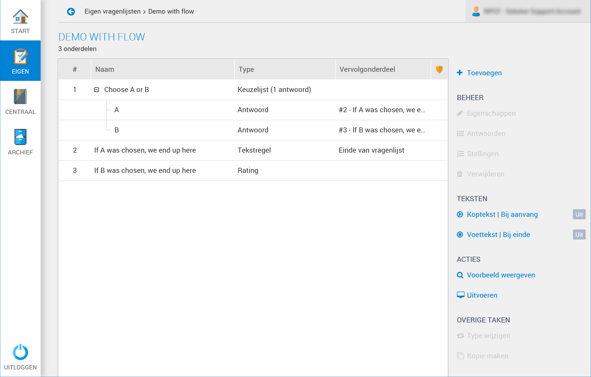
And we also quickly learned that most people don’t like to fill out surveys at all — let alone lengthy ones (we certainly don’t 😂). So, we realized that surveys need to be as compact and engaging as possible and should flow much more like real conversations, asking only the relevant questions to the respondent, rather than subjecting them to answering irrelevant ones. To do that, you need decent flow logic — often referred to as skip logic or display logic. The magic sauce that makes a survey smart. That’s why most survey tools, just like ours, offer that functionality.
We believe good forms are smart forms. They should flow like conversations. But those only really work with sound logic. And building the right logic can be challenging.
But there’s a remarkable similarity between most survey solutions: All editors tend to work generally the same! You enter questions in a flat list — often organized on pages — and during or after that, you use a separate logic manager to specify the rules for the display or skipping of the different survey elements. The disadvantages of this approach are fairly clear, particularly for the end-user who needs to design the form:
- There is no good overview of the structure of your form or survey because of the lack of visualization of flow, requiring you to manage the entire model in your head;
- Collaboration is hard because it is not easy for other people to understand the structure of your survey at a glance, making them go through the nitty-gritty settings all the time;
- You become more of a programmer creating spaghetti-like code by defining logic, further steepening the learning curve;
- As soon as the logic rules are defined, it often becomes problematic to easily apply structural changes to your survey without the risk of bringing down your careful composition;
- Some of the more advanced editors do offer drag and drop to quickly rearrange questions, but then they often don’t work (well) on touch devices or particular platforms;
- The ability to use logic in the first place is often a separate, expensive ‘pro’ feature, requiring you to pay before you can use it.
We think it is just way too hard to use flow logic in forms and surveys. Let’s create a survey tool with a visual editor for creating forms and surveys. Embrace flow logic at the core of everything to make it easy to use. Make it work on every device and every browser — mouse, touch or pen. Light as air, fast as light. Boom, that was our idea!
Building it
To be able to let the creative juices really flow, we decided to take a different approach to development than we traditionally would, where we allocate a fixed budget and timeframe for a software project. This works perfectly for well-defined projects with strict specifications, but often limits creativity. We decided to throw all of that out the window.
We had the time and funding from our SaaS business to do whatever it was going to take to build what we envisioned, and to make sure we wouldn’t be bogged down or pressured, we went dark in our newly-founded lab 👨⚕️ until we had something ready for critical review by others.
”Once you free your mind about a concept of harmony and of music being correct, you can do whatever you want. So, nobody told me what to do, and there was no preconception of what to do.” — Giorgio Moroder, Italian singer, songwriter, DJ and record producer
Key concepts
So, what did we learn building Tripetto? A lot, actually. Here are the most important distillations from our trials and errors in the lab 😉.
Self-organizing storyboard (with active allineation)
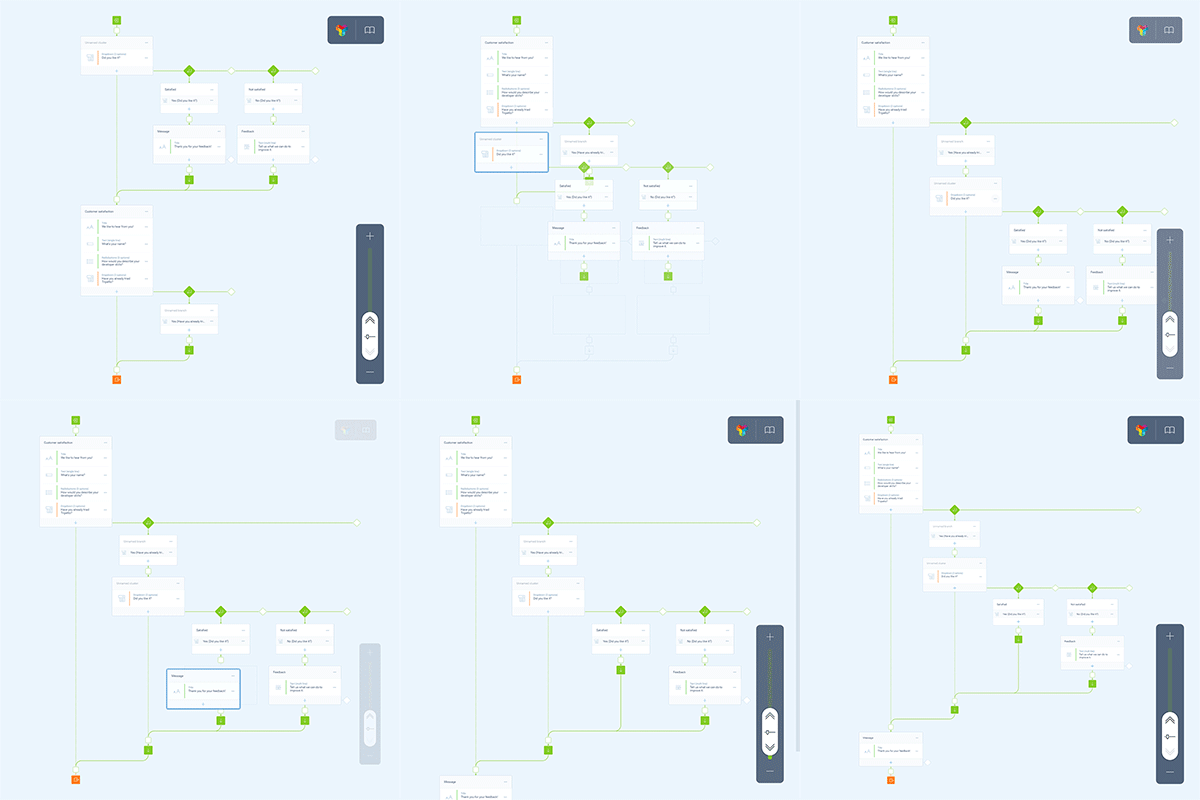
It was important to us that the core of whatever we built was a truly visual way to create forms or surveys, with a 2D storyboard. We also believed that the board had to always automatically be tidy and organized to optimize overview. Items should never overlap. That is quite unlike most flowchart tools, where items unintentionally start to overlap as it becomes more complex and you end up endlessly reorganizing instead of building what you want. That was a definite no-go for us, and after countless iterations we got to what it is now. We ended up calling this feature active allineation, where it continually aligns your form structure as you alter its arrangement — automagically.
Improved drag-and-drop (with layout guidance)
We wanted people creating complex forms to be able to grab any item on the storyboard and drag it around very easily, with smooth scrolling when dragging beyond the screen edges, like you would expect from any native consumer-focused tool. But we wanted something more to improve the drag-and-drop metaphor for our storyboard. We created active visual guidance on where to drop items along with whole sub-structures of all of shapes and sizes. Moreover, we wanted sticky guides, so when you release something with a guide in sight, it would grab what you’re dropping and absorb that. We call it layout guidance and it goes hand in hand with active allineation.
Smart zooming
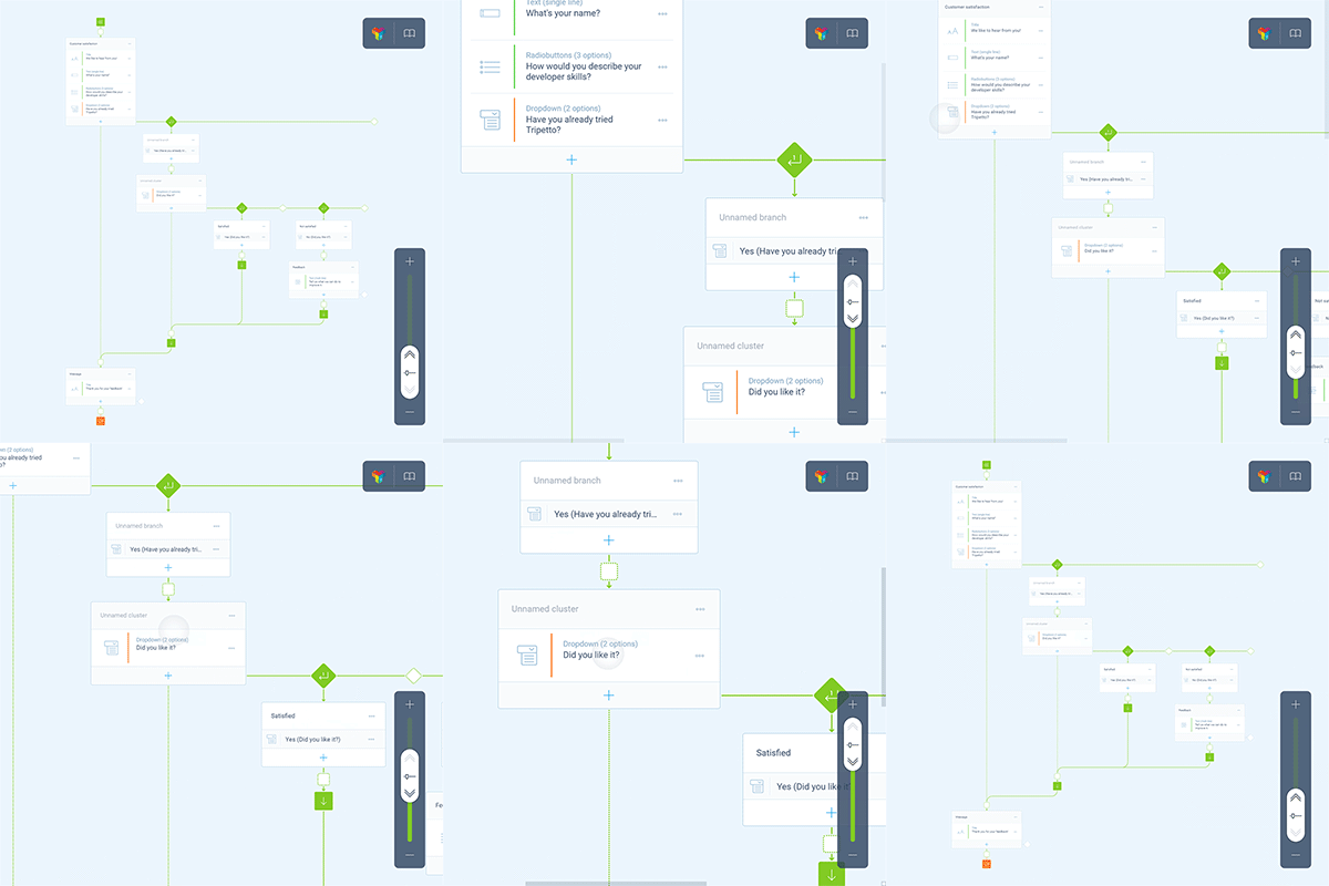
We quickly found out that without decent zoom functionality the editor is futile as soon as form structures expand beyond the screen edges. But it’s hard to solve perfect zooming in just the browser and for all devices — for highly graphical and expansive structures. Moreover, we had to make it work on all devices. The magic mix is one with a smart slider, pinch to zoom and a double tap shortcut.
User interaction (mouse, touch, pen)
One of the toughest nuts to crack was to make the editor work identically on any platform and device — mouse, touch and pen. Tripetto wasn’t going to be a native application and had to run in all browsers. Allowing users to pick up and drag items across and out of the screen while having the storyboard scroll in the right direction turned out to be very hard in a browser because this breaks default browser scrolling behavior. The only solution was building our own interaction layer to handle these interactions in the browser.
Feature cards
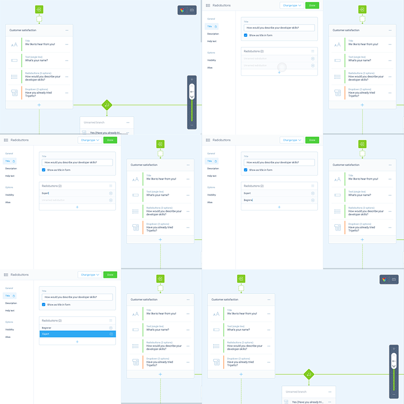
Another thing we often see in survey tools are elaborate properties dialogs with all kinds of settings for questions. For example, even if you’re just adding or editing a simple text input question, you’re likely also presented a long list of all the options you might like to use, even if doing so is rare. We turned that around, presenting just the necessary elementary settings and allowing the user building the form to unlock additional settings sections fast by selecting them in a feature menu — without reloads though. That cleans up nicely.
Headless collector
The visual editor of Tripetto is the flashiest part, but our kit also comes with a ‘collector’ for deploying and running surveys, and gathering responses from end users. Our first assumption here was we should build a beautiful front-end with the slickest interface ever hatched. But, as developers of survey tools for the healthcare market in our other company, we knew it is essential to also support alternative output/input devices to ensure optimal accessibility for everyone. Respondents on those devices don’t need or benefit from insane GUI’s. They need semantics. And so, we didn’t develop the user interface at all 😎.
We left the parts of the SDK responsible for parsing, handling logic and other technical stuff headless — without graphical user interface. That permits the development of all kinds of front-ends, optimized for different audiences. For example, you can make a collector with a neat interface optimized for touch-enabled devices, or one optimized for visually impaired respondents, using a voice synthesizer and speech recognition to take them through the survey.
And while working on that approach, we came up with another idea: Why not see the collector as a stand-alone computer (or state machine) and virtualize it? This has some significant advantages.
- Survey sessions can run entirely client-side without the need for server round-trips, which has performance benefits for the respondent, but also helps with load-balancing on the back-end;
- Respondents are able to pause sessions and resume them later on in the exact same state they left them in — even on different devices.
Ultimately, we decided the collector library should be free so that developers can easily build their own collectors with their preferred framework. We offer out-of-the-box implementations for React, Angular, Material UI, Angular Material and more to get developers going. Dive into the collector docs here.
Extensibility
Building blocks are the last component that brings it together, by allowing developers to extend it. If we give developers the tools to build custom collectors, they probably want to decide themselves which question types (we call them building blocks) to support in the editor and collector. And they should be able to develop their own, too. To get developers going, we offer a boilerplate to jumpstart custom builds. Dive into the SDK for building blocks here.
Final words
Long story short, Tripetto is now available for anyone to use. It’s free of charge for most use cases. We invite anyone to create stunning forms and surveys with the editor. And we encourage developers to integrate the editor seamlessly into their projects and hatch awesome collectors and insane building blocks. Share them with the world as you like. All the technical docs can be found here. Check if you need a paid license here. Contact us about the right license for you.
Feel free to contact us if you run into issues or want to give us feedback. We’d love to hear from you. Stay tuned for more features being released. We hope you like it!
