Forms don’t need to suck
How better logic flows can help.
Everyone knows how painful it is to fill in a form or survey that makes you repeat your answers, enter information for pointless questions, or have you endlessly click through irrelevant sections. The problem isn’t you — form logic is so difficult to implement that most survey creators don’t even bother.
But, if you’re building a form and don’t use proper logic you risk losing the majority of your respondents to sheer boredom. As the questions get irrelevant, or the flow seems to continue forever, people start to close the tab — leaving you without any answers at all.
Logic flows are the bits that wire up a form to make it intelligent, helping make the experience smoother for people answering it, and skipping over the irrelevant questions to save them time.
A practical example of this is a survey that asks different questions if you choose ‘coffee’ as your favorite drink, hiding those that would appear if you prefer ‘tea.’ If you choose coffee, the survey asks you how you prepare your beans, what kind of grinder you own and so on, but doesn’t show any further tea-related questions.
Logic is difficult
Today’s tools make using meaningful logic flows really difficult to do in lots of ways. SurveyMonkey, Typeform and others make you define your logic in a complicated list view, without an easy way to see it from a high level — in most cases there’s no easily readable overview or map of where users might end up, and often logic is easily wired up wrong, so it isn’t implemented at all. Or even worse, it’s behind a paywall.
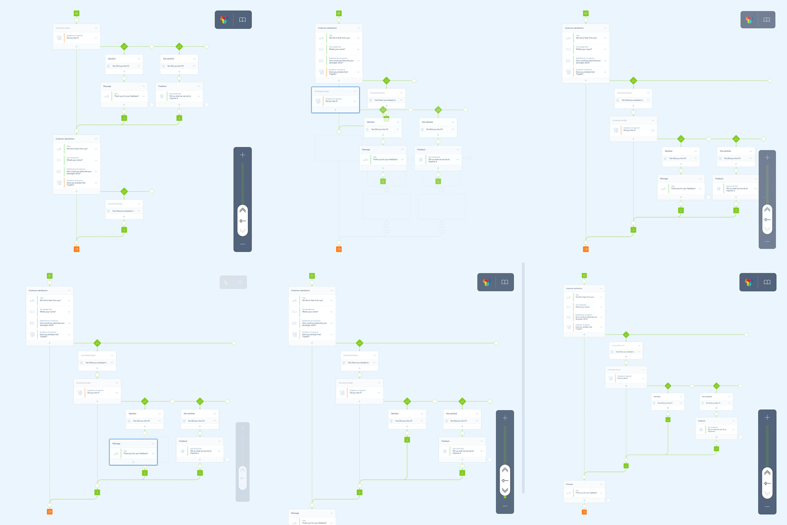
Most of us think visually, so it makes sense to imagine the flow of a form with a drawn-out flow map or simple overview rather than a blob of questions in a list. Tools like Tripetto, however, make this easier by turning the logic-building experience into a visual, touch-friendly editing experience (more on touch in a bit.
Instead of building a list of questions, connected answers and additional logic with a mouse, Tripetto allows the creation of complex flows with a drag-and-drop editor. That helps build a better visual map of what’s really going on under the hood, and makes it easier for other people in the team to interpret the flow with little context.
That visual map also helps ensure there isn’t anything wrong before it’s too late. It’s easy to quickly look over the survey before it’s published and be sure it’s not leading a respondent down the wrong track. With more than a small handful of questions, this isn’t an easy task when it’s a giant list!
Humans prefer touch
It’s a fact: we now expect touch screens almost by default, and most form builder tools simply don’t adequately support them both in the editor experience and the resulting form.
This is bizarre, given that the majority of modern devices feature a touchscreen, like the iPad Pro and Microsoft Surface, along with almost every laptop on the market today. Touch is a much more intuitive way to build, re-arrange and edit these flows as they grow, and with a visual overview it makes even more sense: if a question is in the wrong spot it can just be dragged with a finger to the right one, rather than created from scratch.

Building these logic flows needs to be as easy as possible, but because the tools haven’t existed to make it simple, we’ve all suffered as a result. Touch-friendly experiences encourage us to build a flow because it’s so natural, but despite that, only a handful of form editors actually adequately support them.
Tripetto’s visual form builder is one of the few that actually supports this integrally, making life easier for both sides of the equation. It doesn’t matter what device you’re on, it’s still possible to build complex flows with just a fingertip and a bit of dragging around.
Logic is how to get answers
Any survey that’s longer than a small handful of questions could benefit from logic flows, but most of us ignored logic because it seemed so complex from the outside — the cognitive load of implementing a flow, and being sure it was correctly understood, was far too great.
But, as we’ve already pointed out, a result of this complexity is that many forms see respondents drop off a cliff the longer they’re answering seemingly irrelevant questions. The key to a good survey is brevity and relevance, which is why logic is such an important piece of the puzzle.
As forms become increasingly complex — with conversational interfaces and ‘smart’ survey experiences — it’s important that form building tools get better, because otherwise customers, users and potential revenue will be lost for not making it as easy as possible to engage through forms.
