How to differentiate your form based on device
Learn how you can use the device type of respondents (mobile/tablet/desktop) to differentiate your form.

When to use
With the built in branch conditions for devices, you can create branches that only will be executed if the respondent uses the corresponding device (mobile/tablet/desktop). For example in case you only want to ask certain questions to respondents that fill out your form on a mobile or tablet device, but not to respondents that are on a desktop device.
The different devices are determined by the screen size. The following screen sizes are used for each device type:
- Phone - Screen width under 400 pixels;
- Tablet - Screen width between 400 pixels and 800 pixels;
- Desktop - Screen width above 800 pixels.
📌 Also see: More logic possibilities
The logic described in this article is just one example of what Tripetto can do to make your forms smart. Have a look at this article to see all logic capabilities:
How to use
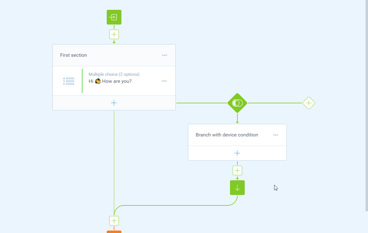
As a demonstration scenario we want to show a certain question only to respondents that are on a mobile device.
Create branch
To do so we create a branch and we add a Device condition. This opens the device screen right away. In there you can now select the device that you want to include in this condition, so in this case we select Phone.
Add follow-up
Now we have setup the branch, we can add the desired follow-up of our form that only will be visible for respondents that use a mobile device (screen width under 400 pixels).
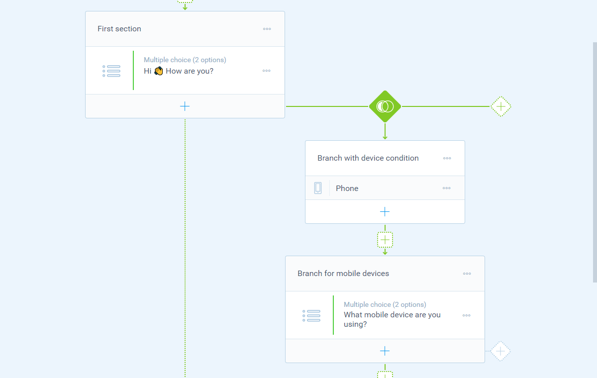
That's it! The form will now show this question only to respondents on mobile screen sizes.