The Complete Guide to Setting Up Effective Landing Page Forms (2022)
Winning conversions can be easier with the right techniques and tools. This post will show you how to use Tripetto to create a stellar landing page form!
When you want to convert visitors into paying customers, you’ll need to pull out all of the stops. Forms are a great way to boost engagement, and landing pages can also ramp up your sales figures. If you combine these into a landing page form, you’ll have a way to make the User Experience (UX) better, and net more conversions at the same time.
A landing page form is something you can use in a number of different ways. A basic setup can help you collect user information. However, with greater complexity, you can generate leads, and make full-blown sales too. As such, getting your landing page forms right is key.
For this tutorial, we’re going to discuss how to create an optimal landing page form, and the tools you need to do the job. First though, let’s talk about why forms have such importance for your web pages.
Why Forms Are Important on a Landing Page (And How They Improve Conversions)
Your landing pages represent a key step in your sales funnel. They will be the point where you attempt to turn a browsing visitor into a lead, or better yet, a customer. As such, the ‘flow’ and path the visitor takes is vital, in that you need to make sure they don’t bounce.
A well-placed landing page form might seem like a trivial detail, but it’s a way to make a personal connection with your potential customer.
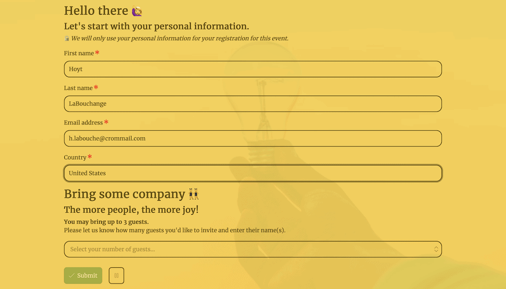
What’s more, a web form on your landing page can keep the visitor walking along the path you set, rather than heading back to your main site to find your contact page. A backward step, in this case, is a poor landing page design choice, and in general, you don’t want your site’s visitors to hunt around for what they need.
Given a wider scope, web forms let you achieve multiple goals on your site:
- You can obtain user feedback on your business, products, and services.
- You’re able to register users on your site, for newsletter signups, new accounts, webinars attendance, and much more.
- There’s a secondary benefit in that you can also generate leads with your forms, given that your users will hand over an email address at the least.
Once you have the information, you will also store it in a structured way. For example, you’ll have clear data collections of email addresses, names, and whatever else you choose to include on your form. This helps with your analysis and reporting, and lets you better understand your user base.
With the right setup in place, you can lower your bounce rate for whatever landing pages include forms. In some cases, you could also use a form as a kind of ‘pop-up’ to keep users on-site for longer.
On the whole, a landing page form gives you the opportunity to control the experience, such as where to send them after completion. However, to do this, you’ll need to employ some typical practices to get the best out of your forms.
The Typical Practices You’ll See on an Optimal Landing Page Form
While you are free to create a landing page (or a form) however you wish, there are a few elements that users will expect to see, or otherwise want to discover in line with other websites. These typical practices are just that – common elements that you’ll find across a number of optimal landing pages and forms.
Call To Action (CTA) Buttons
Your CTA is a key aspect of both a form and a landing page. It’s an instructive verb – a literal call for the visitor to do something. Your CTA verbiage is an area that likely doesn’t get much thought, but you should consider how you present your CTAs across every aspect of your site.
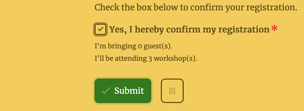
In a nutshell, you’ll want to make sure that the wording of your CTA aligns with the action you’d like the user to take. For example, a general-purpose form submission button might use a simple, “Submit” CTA:
For an e-commerce store – also appropriate for landing page forms in some cases – you’d see wording such as, “Buy Now” or “Add to Cart”:

It also makes sense to ensure that your CTA and associated buttons are prominent and visible on your site, as it will encourage your users to take action after they interact with your content. This is where color theory and contrasts come into play. You won’t need to think too hard about this for basic applications, although the scope is there to do so.
Our advice is to make your buttons the most visible element on the page. You can test this out in a crude way by simply altering the button color to something ‘garish’ and work back from there until you have a color that suits the rest of your site.
It’s not scientific, but if the button becomes prominent and easy to spot, you’re good to go. If you want to dive into optimal placement a little more, you could always look into split or a/b testing to find the option with the best conversion rate.
Form Placement and Length
You can also get deep when it comes to site layouts, especially when it comes to forms. Websites will generally take cues from newspapers, in that the most prominent information will be ‘above-the-fold.’ For browsing the web, this means your form might offer visibility on the screen without the need to scroll:
However, this isn’t as essential as it used to be before responsive displays and smart devices became the dominant way to browse the web. Now, you’re able to place forms almost anywhere on the page.
What’s more, mobile users will need to almost always scroll through a site, so you don’t need to have the constraints you once did. Our advice here is to consider your layout and place your landing page form in a suitable location. If this means it sits above the fold, even better.
The length of your form will also tie into its placement. For example, a super-short form could likely go anywhere you wish, while a longer form will need more specific placement. Imagine a situation where your long-form sits at the top of the page. It could be that you see poor conversion and completion rates because you haven’t provided any context for your form.
Also, the longer the form takes to complete – whether through literal length or questions that require deep answers – the less likely a user will do so. Instead, they will become another statistic with regard to your bounce rate. In a later section, we’ll discuss how conditional logic can help take a long-form and break it down based on the previous responses.
Default Values and ‘Free Writing’ Fields
If you can carry out some of the work for the respondent, they will have less to do while you still get relevant information. This is where setting default values for your fields can help your completion rates, give you better data to analyze, and still provide the right level of service to your user base.
This is something you can achieve using a Set Value block within Tripetto (more of which later):
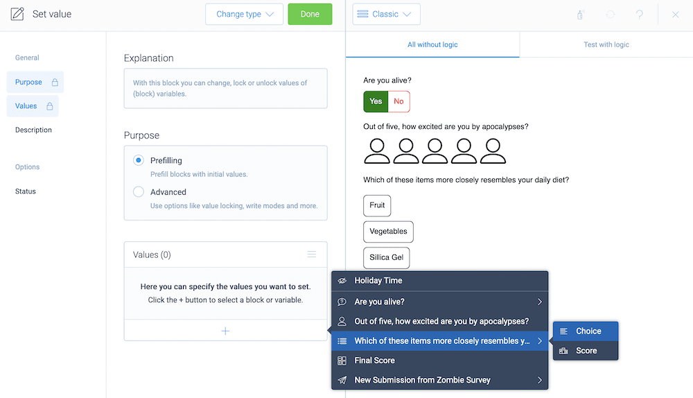
In a simple implementation, you could pre-fill a name field with something generic (that you’ll be able to recognize within your analytics.) In a grander implementation, you could populate an address field with a country, for example.
In most cases, you’ll get lots of value out of making sure checkboxes and radio buttons have a default value. At first, your forms may not get this selection right. However, once you begin to see more completions, you can refine these selections and create a landing page form with a better UX.
Speaking of which, it’s always good to give the user a way to provide ‘free written’ feedback through longer-form text boxes. For example, these are often where you get to provide any other comments that the form doesn’t cover:
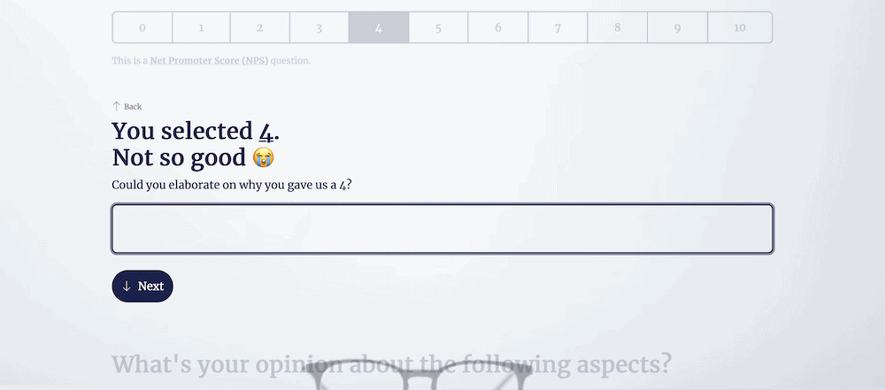
This will serve a few purposes. First, you can give the user a voice of their own to comment on your business, which is important to cultivate loyalty and trust. What’s more, you give the user an ‘out’ in order to let you know about something your form doesn’t include, but should.
After a while, if you see the same points of feedback, you might want to consider revising your form to incorporate those elements.
Advanced Form Functionality
You can get far enough with basic form functionality that you may not need anything else for your own site. However, a landing page form will benefit from a few advanced areas of functionality, especially if you utilize some of the advanced practices for those forms.
For example, long forms often have a lower completion rate. However, good form design will also often need to ask all of the questions it contains. The solution is to use conditional logic.
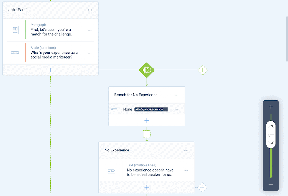
This is where you’ll use ‘conditions’ (such as AND, OR, and others) to branch users off to other areas of your form. For a real-world example, consider how you might choose to use conditional logic for a simple ‘Yes/No’ radio button question.
If the user selects ‘No’, your conditional logic will skip over the next few questions that aren’t relevant, and take them to a later section. This cuts down the form for that specific user but doesn’t dilute the core set of questions you’ll ask. On the whole, conditional logic is a powerful aspect that you can’t ignore for your own forms.
Analytics
Because you have many tools available to glean the best and most relevant answers to your questions, you’ll also benefit from regular analysis of the data you collect. This has a multitude of benefits:
- You can look at general metrics surrounding how users engage with your forms, such as the completion rate, how often users will begin a form, and more.
- You’re able to judge which questions see the greatest number of answers, and which ones users leave alone.
- On a broader level, you also get to see why users choose to not complete your form, down to where exactly they ‘drop off.’
Once you can see the relevant metrics and numbers relating to your forms, you can understand just why your form performs in a certain way. From there, you can make further changes and tweaks based on your responses and user base.
However, before you get to this point, you need to create a form in the first place. Over the rest of this tutorial, we’ll show you how to do it.
How to Create a Landing Page Form
There are plenty of ways to create a landing page form for your website. For example, you may want to code a solution yourself. However, while this gives you the ultimate level of flexibility, you have an uphill battle when it comes to maintenance. This is even before you assess your own level of coding knowledge, which needs to be high.
Instead, most WordPress users will look for a suitable plugin. Fortunately, there are lots of form builder plugins available, both free and premium. However, we think Tripetto beats the competition. We’ll discuss why this is in the next section.
How Tripetto Can Help You Create Your Own Landing Page Form
In a nutshell, Tripetto is one of the best ways to create a smart, conversational landing page form. You get deep customization options with built-in templates, lots of valuable integrations, and the opportunity to store your replies within your WordPress database.

Tripetto looks to provide almost every feature you need to create an effective and optimal landing page form. Its functionality has a wide scope:
- There’s a drag-and-drop form builder and editor available from the WordPress dashboard. This offers a flowchart-like approach and means you can see all of your form’s branches and logic at a glance.
- You have plenty of ways to integrate over 1,000 apps into your forms, using webhooks. This lets you bring in third-party services such as Mailchimp, Google Workspace, and much more.
- Tripetto includes conditional logic functionality as standard, so you can build this into your forms, without limitations.
- You have a wealth of design options to help make your forms look the part, as well as act the part. This is for almost all aspects of your form. This includes Tripetto’s ‘form faces’ – a way to create a specific type of form without any effort.
Conditional logic is a primary feature for Tripetto. You have a lot of different ways to build logic conditions into your forms, which means you have full scope to create whatever experience you wish. For example, you can create different branches based on the answers to previous questions, or even help users skip over certain irrelevant questions.
What’s more, you can store answers as variables and recall them at a later time within your form. You can do this with other values too and potentially use hidden fields to carry out some of these calculations under the hood.
Speaking of which, Tripetto also includes an advanced calculator that means you can run functions, carry out complex mathematics, evaluate values, scoring throughout a form, and much more.
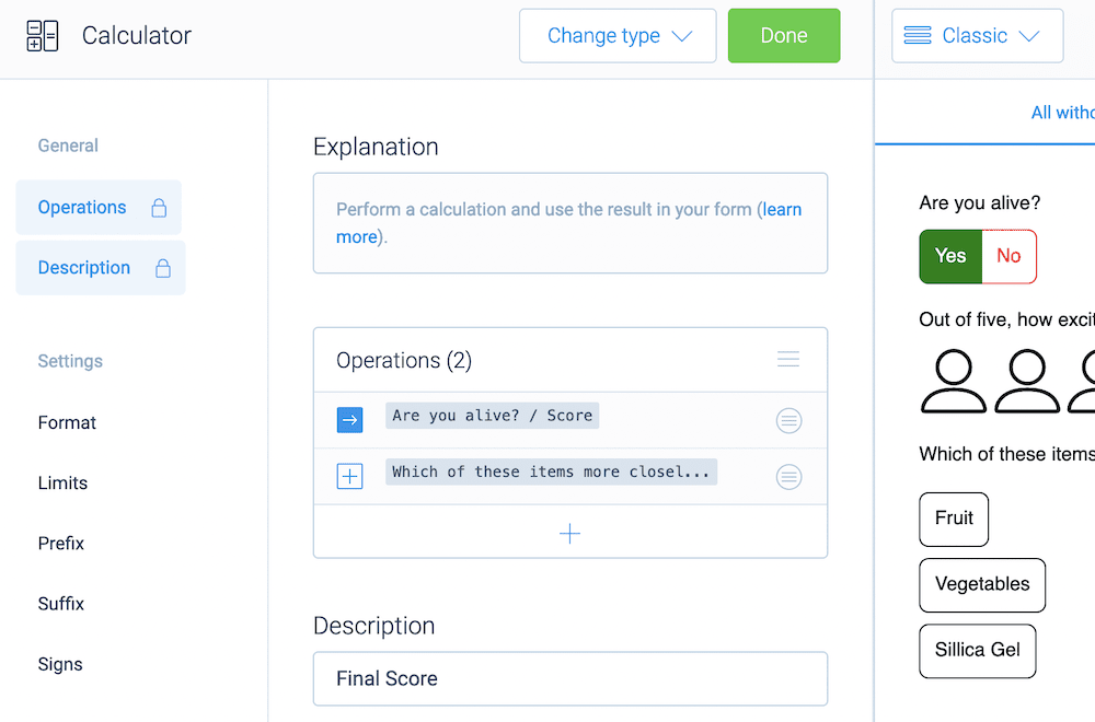
In the next section, we’ll look at some of these options within the context of a complete form within Tripetto.
An Example of Tripetto In Action
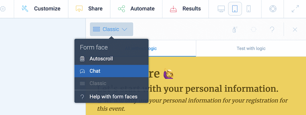
One of the big ways Tripetto can help you with form design is through unique ‘form faces’. These are ‘skins’ that help change the look of your forms within an instant, but without altering any of your under-the-hood design. There are three to choose from:
- Classic form face. This is the typical look of a form, in that it will display the fields as you present them.
- Autoscroll form face. Here, the form will highlight each question and automatically scroll to the next one. If you use Typeform, this mode will be familiar to you, especially the progress bar indicators and multi-step form layout.
- Chat form face. You can also present your form much like a conversation. This is a fantastic way to grab more ‘humanistic’ insights, as respondents will often give you much better answers if the form presents a conversational tone.
Even better, form faces are straightforward to use, you just need to select your option from the drop-down menu above your form’s preview within the storyboard:
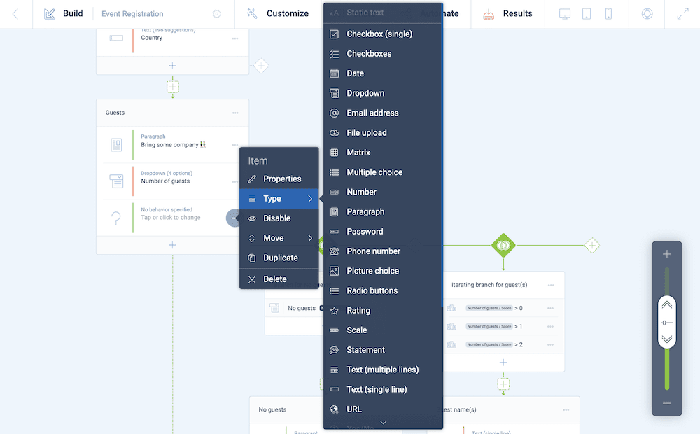
The storyboard is where you’ll build your form, and the flowchart-like layout lets you build in an intuitive way. For example, you can use the various ‘Plus’ icons to add new elements, sections, and blocks to your forms.
You can move around each of these in a snap using drag-and-drop functionality. It takes a handful of clicks to add a new item and specify a new behavior and type from another drop-down list:
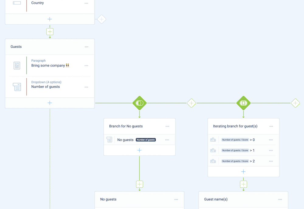
You can also set up different branches in a minimal number of clicks, again from the storyboard. This lets you set up different paths based on any number of elements. In our example, we have a drop-down to denote the number of attending guests. The branches head in different directions based on the answer:
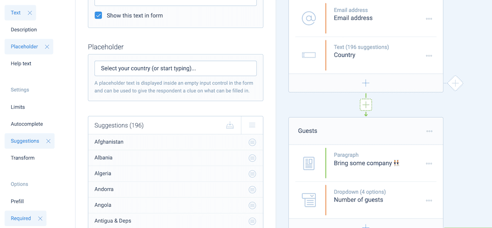
You’ll also find further options on two hidden sidebars, for example, type-specific options can be found on the left-hand side.
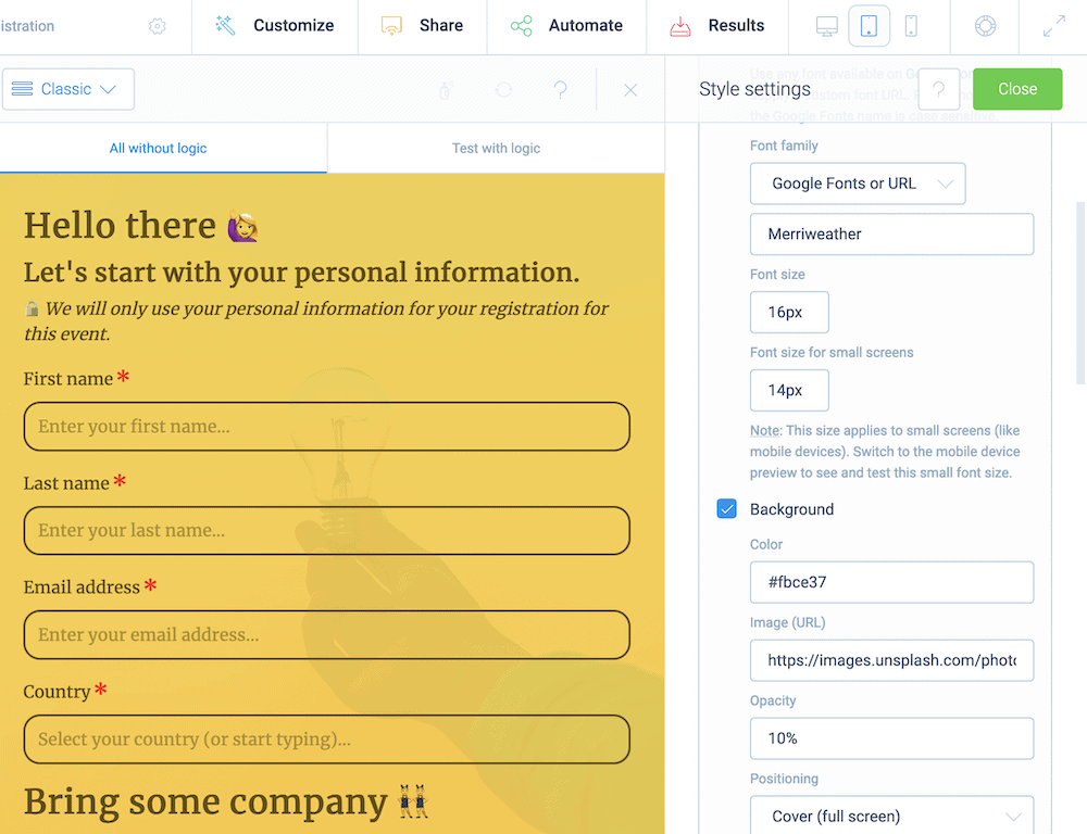
You’ll find design options on the right, under the ‘Customize > Styles’ option:
Sharing your forms is also straightforward. You can use the functionality of the native Block Editor, an Elementor widget, or a shortcode to display your forms. All of these will offer a mountain of options to showcase your forms in the best light:
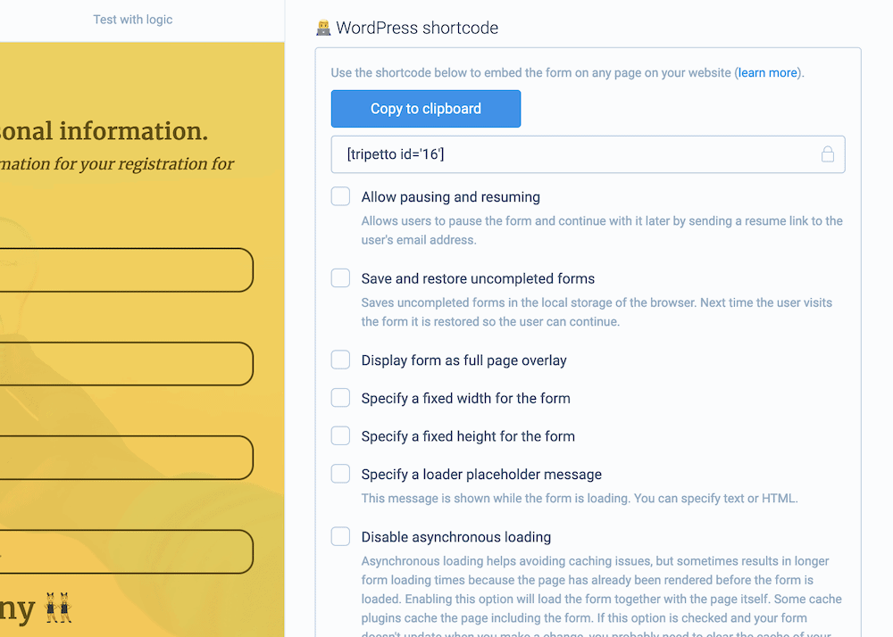
There’s even the option to share a URL directly to the form. This will be great for social media, as you can spread the word across your channels, then bring that traffic back to your site. In turn, this will lead those visitors into your sales funnel, and will also give your Search Engine Optimization (SEO) efforts a boost.
There’s plenty more that Tripetto can offer you, and the Help Center is stacked with articles, tutorials, knowledge base pieces, and direct support to the team.
Conclusion
Forms in general let you interact with users on your site, albeit at a basic level. Still, this dynamic inclusion has a lot of scope and a form will perform the best in areas such as lead generation, user engagement, and more. If you include one on your landing pages, you can send your bounce rates through the floor, and nab higher conversion rates.
A landing page form needs a tool with the right blend of features and functionality. While there are lots of WordPress plugins on the market, only Tripetto can offer almost everything you need to build and display gorgeous forms. Regardless of whether you need a simple contact form or a dynamic marketing aspect for your site, Tripetto can serve you. It’s the only plugin available that includes conditional logic, advanced calculations, switchable form faces, and more in one package.
What’s more, a single-site license for Tripetto is $99 per year. This includes every feature within the plugin, and comes with a 14-day money-back guarantee – no questions asked. Why not try it today?

