
Best Practices for Contact Forms - 15 Tips to Apply for Success in 2022
Forms can increase engagement, and your contact forms are central to this. This post will discuss some essential contact form best practices!
If you only use one type of form on your WordPress website, a contact form is likely to be it. This is one of the most direct ways your site’s visitors can reach you. It’s also a viable tool for lead generation. However, if you want to maximize engagement and conversions, and minimize drop-offs, you’ll want to employ some contact form best practices.
While a contact form can seem straightforward, you can build in lots of complexity. For starters, you can think about your Call To Action button (CTA) and the layout as you would the entire page. From there, you can use advanced functionality such as conditional logic to improve the User Experience (UX) and boost your conversion rate.
In this tutorial, we’re going to show you a number of contact form best practices, and include examples along the way. Before that, let’s discuss why a quality contact form can be vital, and what goes into one.
Why It’s Important to Use Quality Contact Forms on Your Website
A contact form can be the link between your business and potential customers – and sales. Your contact form is the way to connect with users, regardless if they find you through Search Engine Optimization (SEO) tactics, social media, paid advertising, or even word of mouth.
However, contact form conversion rates are some of the lowest around. A typical rate is around 3–5 percent, so you’ll want to make the path to completion easy. The internet in general delivers information overload and sensory overwhelm. This means any excuse a user has to skip your web form is valid: It could be too long, difficult to parse, or even suffer with its navigation.
However, if you can convert as many users as possible, you have the opportunity to turn them into leads, potential customers, and new sales.
The Components of a Great Contact Form
A stellar contact form should have a good design, an easy-to-follow experience, and great content and copy. The form should guide the user by the hand, such as what fields to fill out, and how to best complete them.
What’s more, a good contact form should present all of the relevant and required information in as few steps as possible. On the whole, a high-converting contact form should encourage the user to fill it out and become a new lead. With some contact form design best practices in mind, you can also create a form that delivers the most conversions possible.
15 Contact Form Best Practices You’ll Want to Use On Your Site
Over the rest of this tutorial, we’ll show you 15 contact form best practices. They’re in no particular order, so we encourage you to read all of them – and apply them to your own forms.
1. Use Smart Forms
Smart forms can turn your contact form into a personal experience that can boost your completion rates. This type of form will guide the user to an answer, based on their replies.
Because a smart form tailors its content to the user, you’ll often see better conversion rates, and higher quality answers. This feeds back into your own marketing and business strategies.
The Tripetto form builder plugin has lots of ways to make your form smart and conversational. For example, you can use piping logic or branch logic to move the user around your form in the most relevant way:
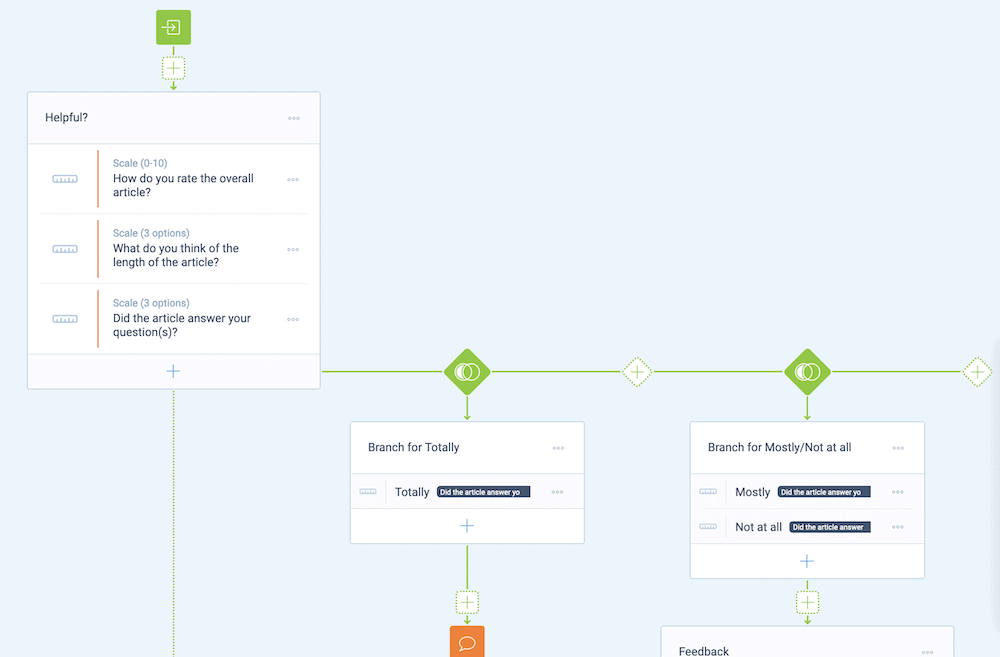
In fact, this isn’t the only application for Tripetto’s conditional logic functionality, as you’ll see next.
2. Show Fields Using Conditional Logic and Personalization
Tripetto’s conditional logic can also help you to show and hide form fields based on certain criteria, such as the status of the response to a question. This can let you create a mammoth form that will only show relevant questions and sections to the respondent.
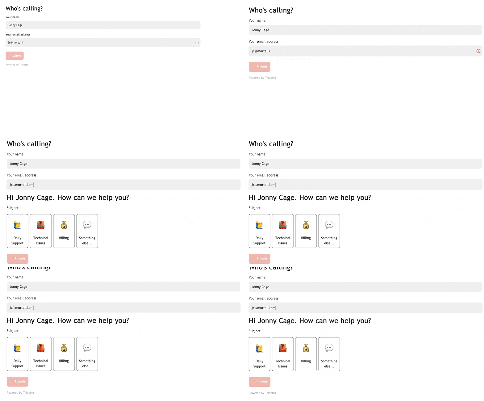
What’s more, you can personalize your form using conditional logic too. For instance, you can ask for a user’s name, and reference that throughout your form.
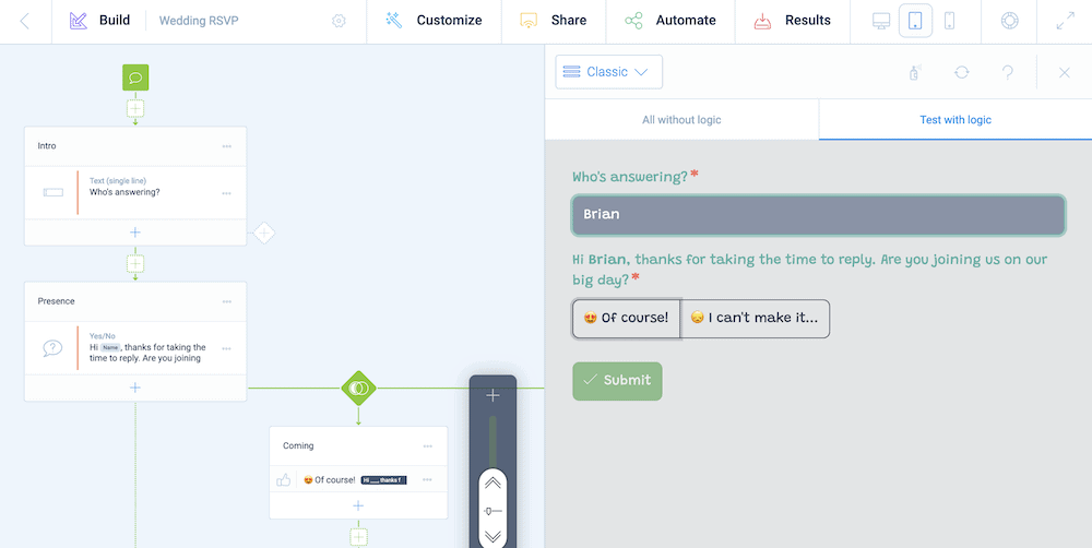
You can also take this further, and show different questions based on a user’s given title, gender, and more. Tripetto’s conditional logic functionality has no restrictions, which means you can create custom forms for your exact purpose and needs, and make them as user-friendly as possible.
3. Put Your CTA Above the Fold
Lots of site owners use a contact form as a kind of CTA. As such, you’ll often find it down at the bottom of the page, or even hidden on a separate contact page, as the ‘period’ to the sales pitch of your site.
However, typical ‘web design 101’ suggests that elements of your site ‘above the fold’ – i.e. part of the page you see first – will experience greater engagement.
Maximizing impressions is the key to increasing your conversions. This means you’ll want to put your contact form where users will see it with ease.
4. Test Your Contact Form Before It Goes Live
Here’s a quick tip that can benefit any type of form, not just contact forms. You’ll always want to make sure your form works before you make it live. It might seem like an obvious tip, but without testing, you can fall foul of bugs and errors.
The most straightforward way to test your form is to submit a query to it, as the end user would. Tripetto makes this simple, using its Test with Logic section of the preview pane:
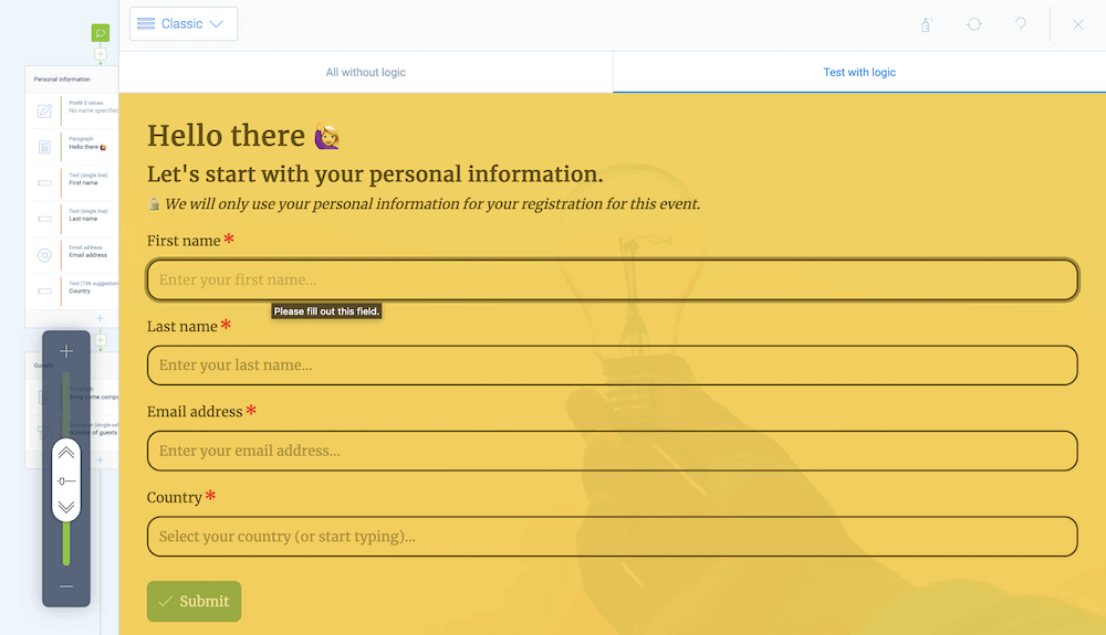
Make sure you also check that you receive the submission. Tripetto stores all submissions within WordPress, so you can see everything at a glance. Once you check whether you have received the submission in your inbox, and within your plugin’s dashboard, you can make your form live.
5. Use ‘First-Person’ Language Within Your Form
Most web content benefits from using second-person language, from the viewpoint of the reader. This uses “you” as the primary pronoun. The result is that content reads as though it’s a conversation, rather than taking place inside an individual’s head.
However, first-person content can resonate more in certain circumstances. For example, one a/b testing case study showed a 90 percent increase in form conversion rate when switching to using first-person language.
You might want to use this in situations where you would like a conversion or a positive action. “Sign me up for the newsletter” could resonate more than “Sign up for the newsletter, ” and end with a new conversion.
6. Make Sure Your Form Matches the Rest of Your Site
If you look into optimizing your forms, you will stumble across aspects such as color contrast. This could lead you to design a contact form that looks different from the rest of your site. However, this might harm your User Interface (UI) and page design, and by extension, your conversion rate.
This can be similar if you use a third-party plugin or custom Block within WordPress. You’ll want to have synergy between your contact form and your site’s design.
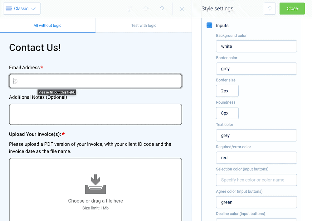
Tripetto slots into your current design choices and workflow. Its wealth of design options, templates, and more can help you match your site’s design, and keep everything in harmony. It also works with nearly every available WordPress theme.
7. Design Vertical Forms
This is a bold statement, but the internet exists only in one plane: the vertical one. We all scroll top to bottom, so this contact form best practice should be straightforward. You should design a vertical form, rather than one with horizontal elements. Eye-tracking studies confirm this too.
This will be most relevant if you have a premium on space. The logical solution is to fill the horizontal space with fields. However, users won’t respond as well to this type of design.
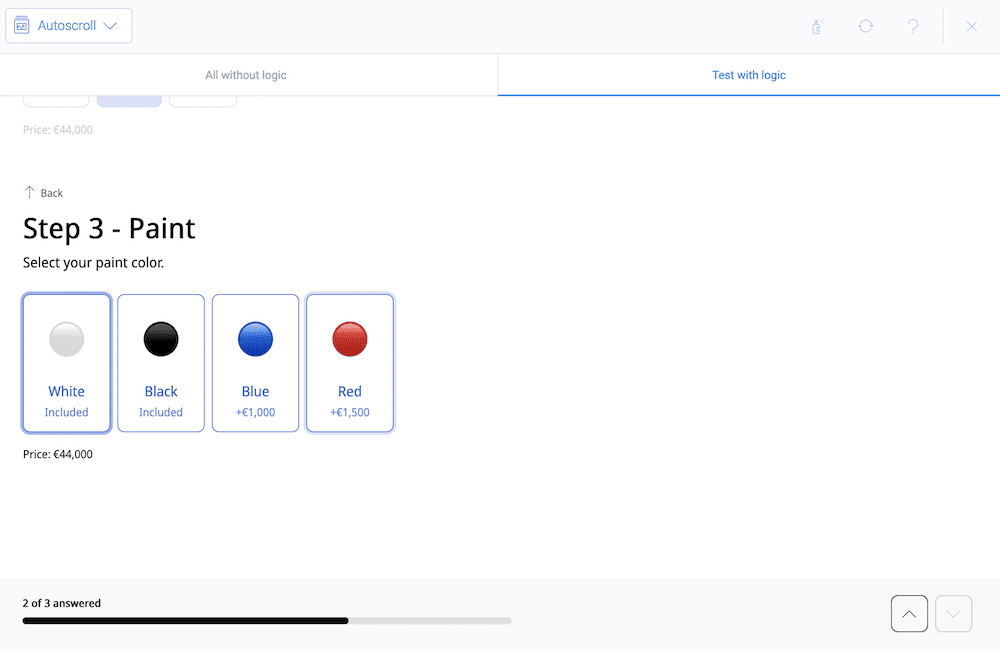
Instead, the better option is to break your form into multiple pages or sections. Tripetto includes unique ‘form faces’ for this purpose. For example, you can use either the autoscroll or chat form face to create natural focus and save some space.
8. Track Your CTA Clicks as Custom Events
Analytics can help you create better forms, which will result in a higher conversion rate. As such, you’ll want to set up a custom event within Google Analytics (or your favorite analytics tool) to tally the click on any relevant contact form CTA button.
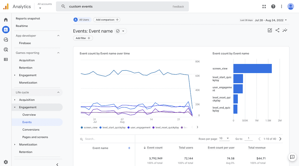
At its core, you can measure your completion rate through a comparison between the number of clicks to your form, and the number of users who fill it out. From there, you can begin to carry out further testing (such as split testing) to refine your content copy, design, structure, and more.
Tripetto includes built-in functionality to capture users who start a form, and those who complete it. This gives you a simple way to optimize your forms, right from your WordPress dashboard, to increase the number of completed form submissions you receive.
9. Don’t Ask for Phone Numbers Within Your Contact Form
Your contact form should offer the least resistance between the user’s willingness and the Send Form button. One way you can do this is to keep the information you request relevant.
For many businesses, it makes sense to request a telephone number in order to follow up. However, lots of users won’t want to give this up. Because phone numbers have an association with sales calls and a general invasion of privacy, a user might choose to leave your form rather than hand theirs over.
Instead, we recommend you ask for an email address. This can achieve the same goals, and it’s something a potential customer will be more willing to send you. If a phone number has some importance, make the field optional (as you can with Tripetto).
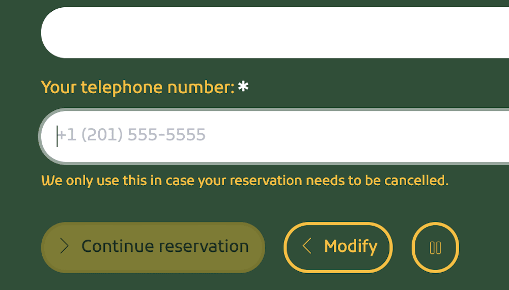
This way, the respondent can fill the form out, and you can send an email at a later date to request further contact information (and say why you need it).
10. Make Sure Your Forms Work on All Devices
Around 60 percent of web traffic is from a mobile device. Some niches will see less or more, but on the whole a good contact form best practice is to design with a ‘mobile-first’ philosophy.
If your forms don’t offer mobile devices an easy way to fill out your form, those users will head elsewhere. The good news is that Tripetto builds responsive design into every form you build. You can see how your contact form looks using the live preview:
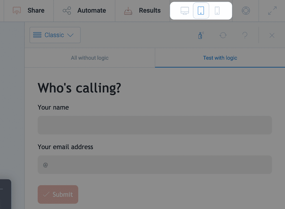
What’s more, there is a simple set of options to switch between desktop, tablet, and mobile devices on the fly while you design. This gives you a quick way to see your forms as the end user will see them.
11. Read Eye-Tracking Studies for Better Contact Form Design
An earlier contact form best practice talks about eye-tracking, and this is something of immense value. These types of studies reveal how a user will subconsciously view your landing page, or even your entire website. You can gauge where they look, how long for, and other elements.
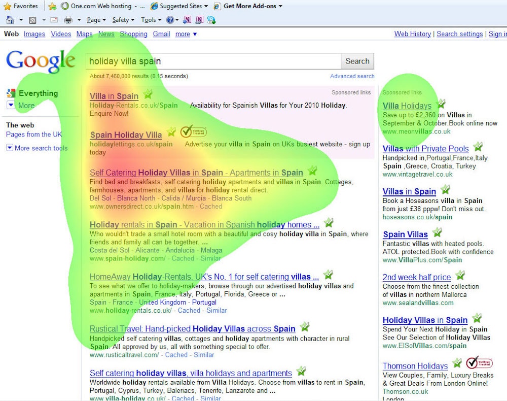
While you do want to focus on the big picture with regards to your form, eye-tracking studies can help you drill down to the micro-moments. These small changes can make or break your form, and raise your completion rates to boot.
12. Use Rounded Boxes
Next, a quick contact form best practice that takes seconds to implement. Rather than use squared buttons or input field corners, choose rounded ones instead – even if the rounding is subtle. The human eye can process these better than squared-off boxes.
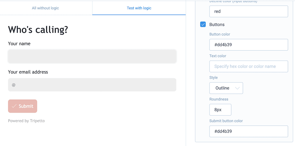
It’s an aesthetically pleasing element that you can add to your own forms using Tripetto’s options. You have lots of ways to customize your buttons and fields, which means you won’t have to suffer with poor, unprofessional design.
13. Allow for Open Formatting
Your respondents should have the freedom to type whatever response they wish into your contact form’s fields. As such, you’ll want to make sure you offer open formatting where necessary, for example, using a Tripetto multi-line text box.

Of course, there are some situations where you can’t do this, such as when you need to ask for an email address or telephone number. However, if you ask the user to conform to a certain standard elsewhere in your form and they don’t want to (or can’t,) you risk them becoming another statistic of your bounce rate.
14. Consider Multiple Pages for Your Form
We talk about structure a lot in this post, but it bears repeating again: users don’t like to fill out long forms. A good way to avoid your multi-step form appearing too long is to split it over multiple pages – you could use the Classic or Autoscroll form faces within Tripetto.
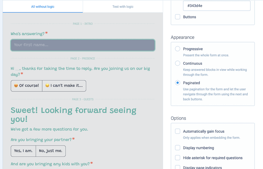
Multi-page forms have a much better conversion rate than a typical contact form, so you’ll want to consider using this when you have a high number of fields and question types.
15. Keep Your Contact Form Simple and Straightforward
Our final contact form best practice is simple. It’s a good idea to keep your contact form straightforward, easy to understand, and a doddle to use. This means you’ll want to consider the following:
- Look to cut out verbose language that includes lots of information. Natural language will give users confidence, and ensure they reach the end of your contact form.
- Simple language needs less commitment too, as the user can read fast, and understand the context you provide.
We state it earlier, but also keep unnecessary fields off of your contact form. Give the user the path of least resistance, and you’ll skyrocket your conversion rates.
Boost customer engagement with contact form best practices
For inbound marketing and sales applications, a contact form is a vital cog in the wheel. It’s also great for engaging with new potential customers. However, abandonment rates for contact forms can be high. As such, you’ll want to create the best contact form you can, using some of the best practices from this post, to keep your abandonment rate percentage as low as possible.
Tripetto is a form builder plugin for WordPress that can help you apply all of the contact form best practices in this list. For example, it lets you build smart, conversational forms that include advanced conditional logic and calculations. What’s more, you have swathes of design options and the plugin integrates with almost any current page builder WordPress plugin. This means you can build everything from simple contact forms to complex multi-page lead generators using your current setup, and no code.
A single-site license for Tripetto starts from $99 per year. You can access the full feature set of the plugin, regardless of the tier you choose. What’s more, you get a 14-day, money-back guarantee on every purchase – no questions asked.

